Continued on page 72
A Food Magazine Too Poor for Photographs Cuts Its Own Tomatoes
No. 4,620, Sunday 8 November 2026
Feature, page 56. Sunday newspaper supplement
A 42-year-old weekend tabloid, a coldset press at 40 lines an inch, and a staff of three who had to stop being polite about all of it.
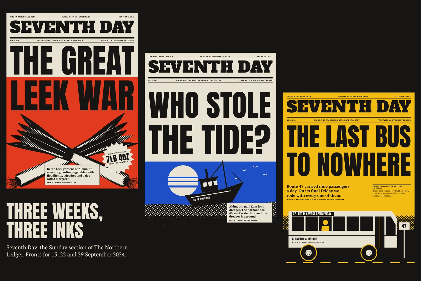
Seventh Day had been the back section of The Northern Ledger since 1982, and by 2023 it was where readers went to find the crossword. Ines Whitlock, the editor, rang me in November with a number: 31 per cent of people who took the Sunday paper opened the section at all, and most of those opened it from the back.1 Her brief fitted on a postcard, and she sent it on one. Make it the first thing taken out of the paper and fought over. Don’t ask for more pages, more staff or better paper, because there aren’t any.
I flew up and spent two weekends at the kitchen tables of nine readers who had agreed to be stared at. What I learned was unflattering to my trade. The old section was dressed as a weekend magazine, with a thin serif, soft colour and a lot of air. On newsprint the air turned grey and the colour turned to mud. Nobody disliked it. They put it on the pile with the car supplement.
Every decision afterwards came from the machine. The Ledger prints coldset web offset at its plant on the Ald: 186,000 copies on 45 gsm newsprint, running from ten on Saturday night. Coldset ink dries by soaking in, so dots spread by about 30 per cent, and the finest screen worth asking for is 40 lines per inch. At that coarseness you can see the dots from across a table. The section gets one spot colour plus black, and the two plates can drift a full point out of register at speed.
The calendar was worse. Editorial closed at noon on Thursday. Ad sales held the right to sell space until four on Friday, and could put it almost anywhere. The staff was three people: Ines, a chief sub called Tom Garrity, and one designer, Hanne Bakke, who had been making 36 pages a week alone for six years and was owed a holiday.
So I stopped treating the press as a thing to be hidden. A magazine look asks newsprint to be something else. A tabloid look asks it to be newsprint, only louder.
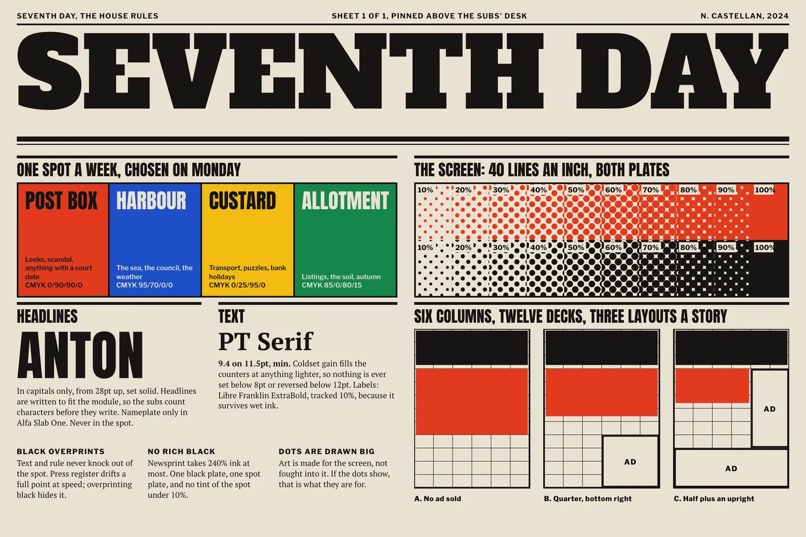
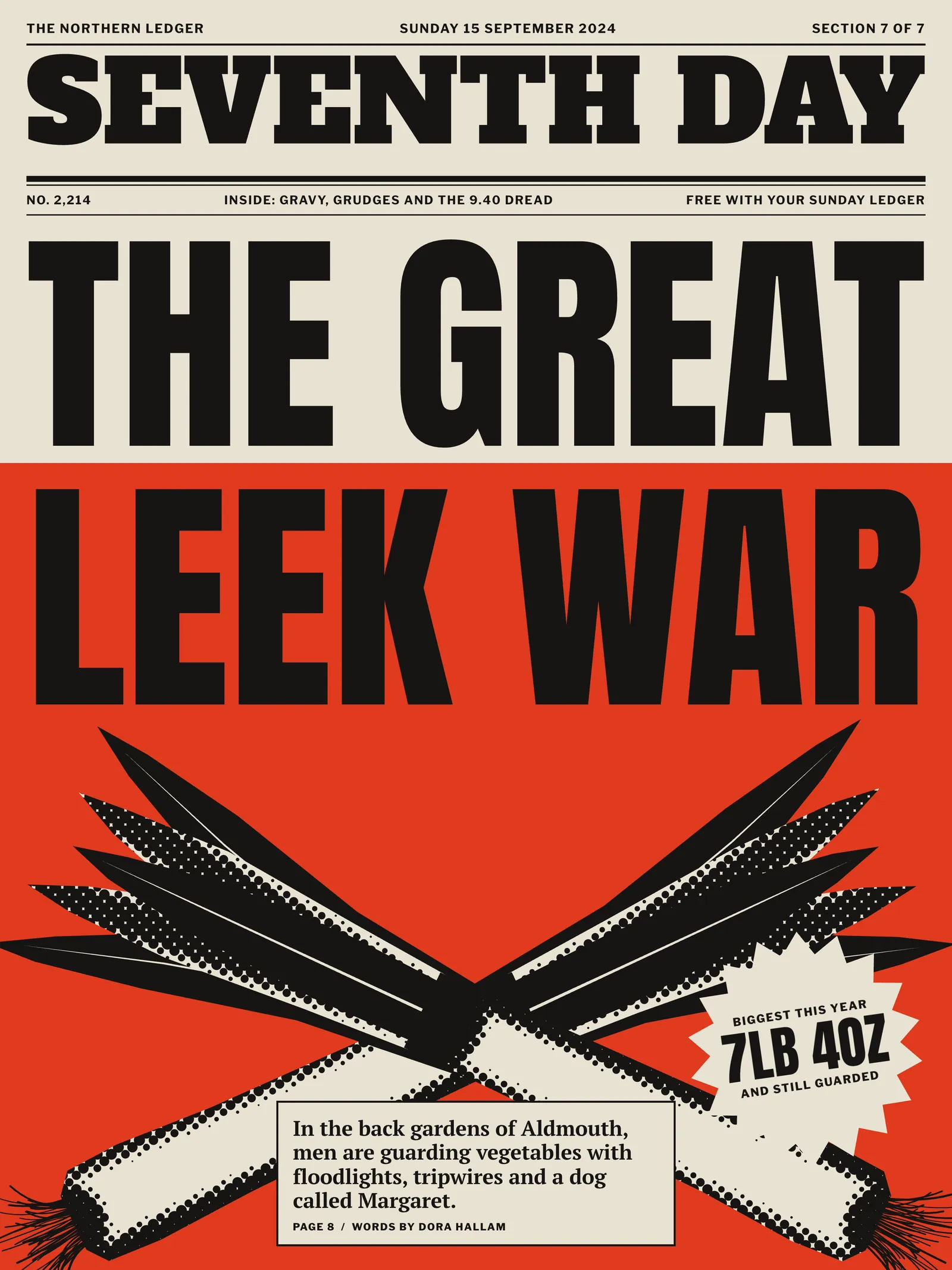
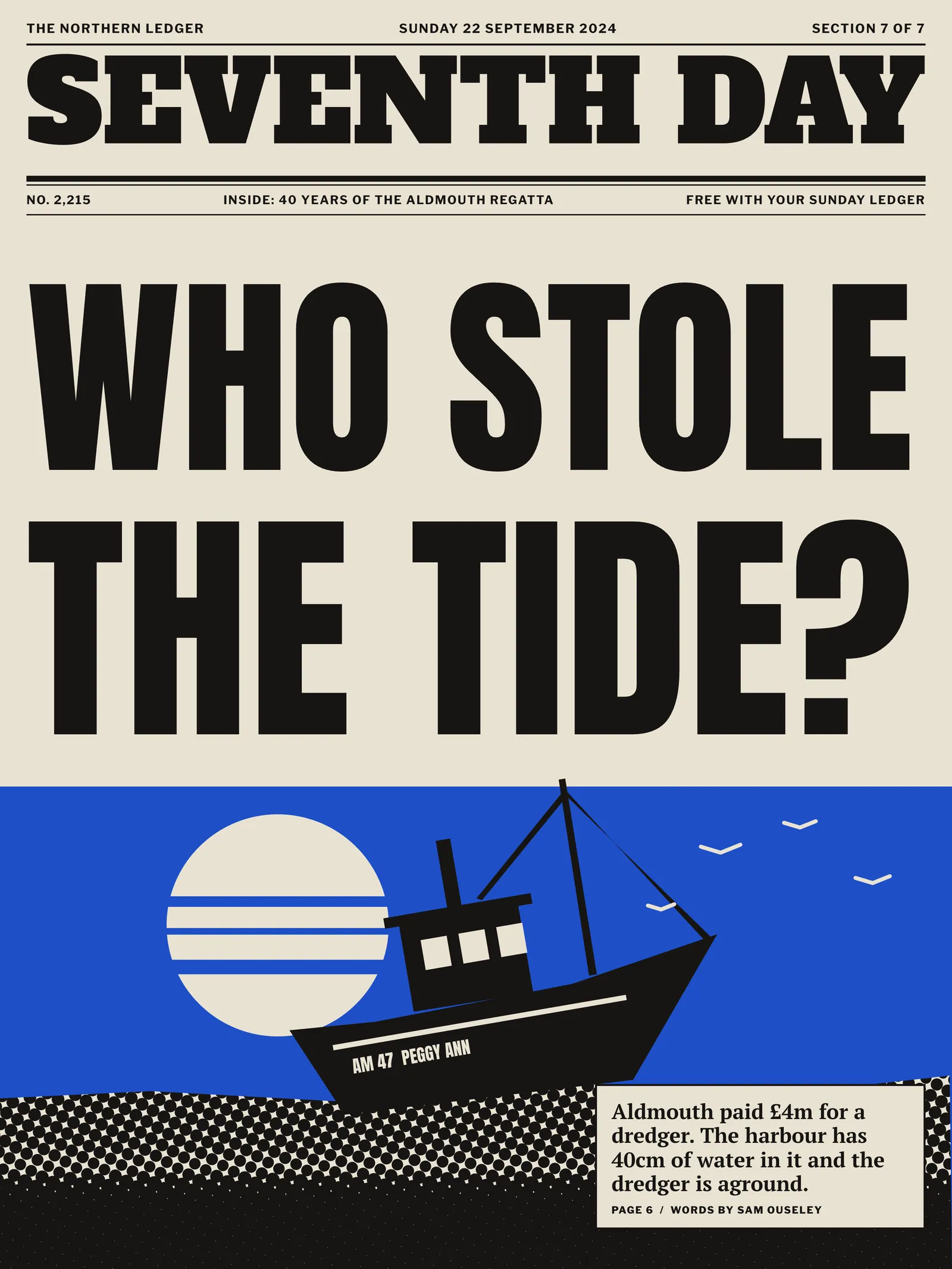
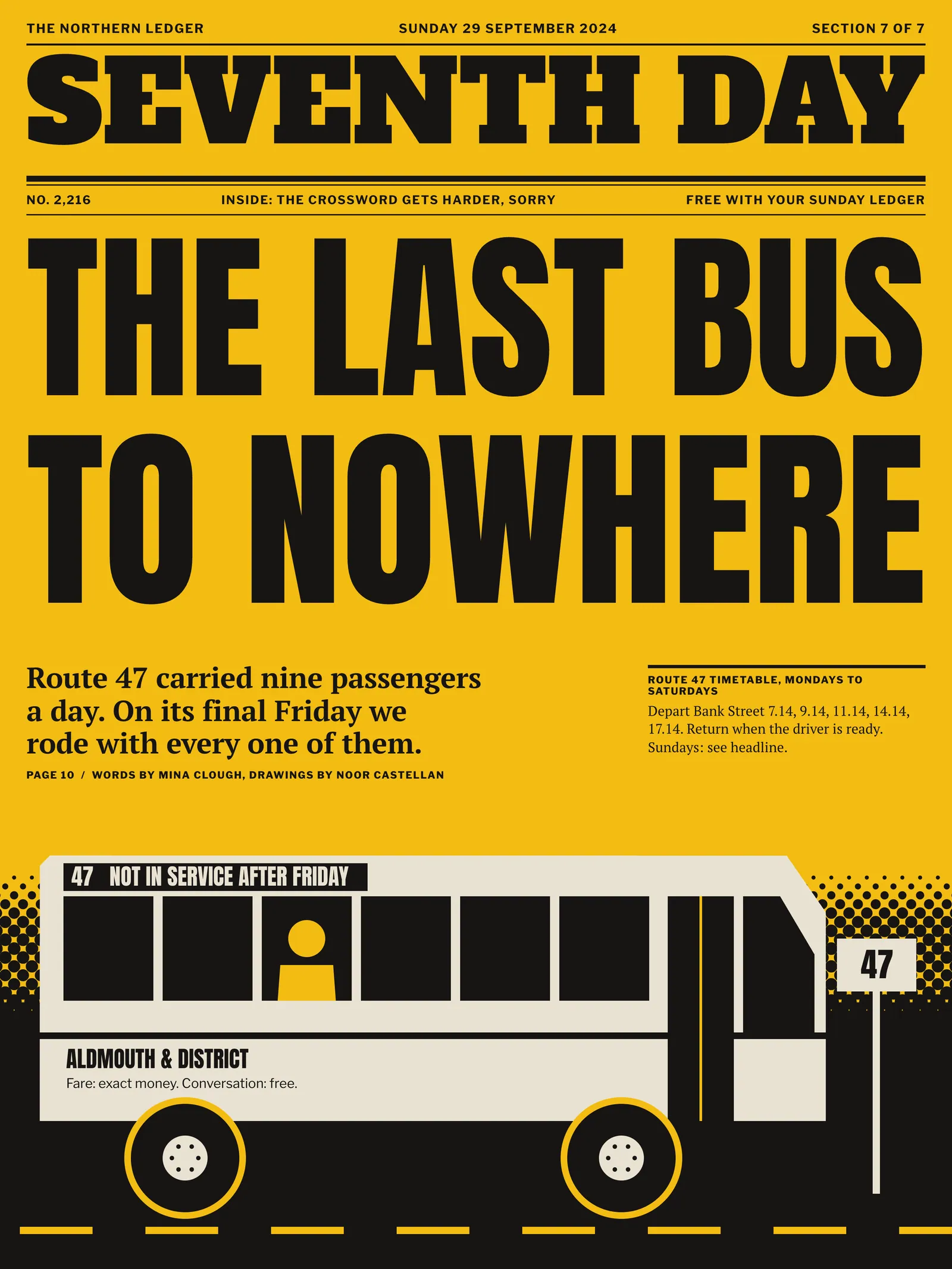
The nameplate went first. It is set in Alfa Slab One, a face with wood type in its bones, as wide as the page allows, and it never moves. Beneath it every front carries one story and one headline in Anton, capitals only, set to fill the measure. Filling the measure means the subs write to a character count, which Tom resisted for a fortnight and now defends in pubs.2
Then the colour. One spot a week, chosen by Ines on Monday from a list of four, each with a loose job: Post Box for scandal and court dates, Harbour for the sea and the council, Custard for transport and puzzles, Allotment for listings and the soil. Readers learned the colours faster than we expected. By Christmas the newsagent on Bank Street was being asked whether this was a red one.3
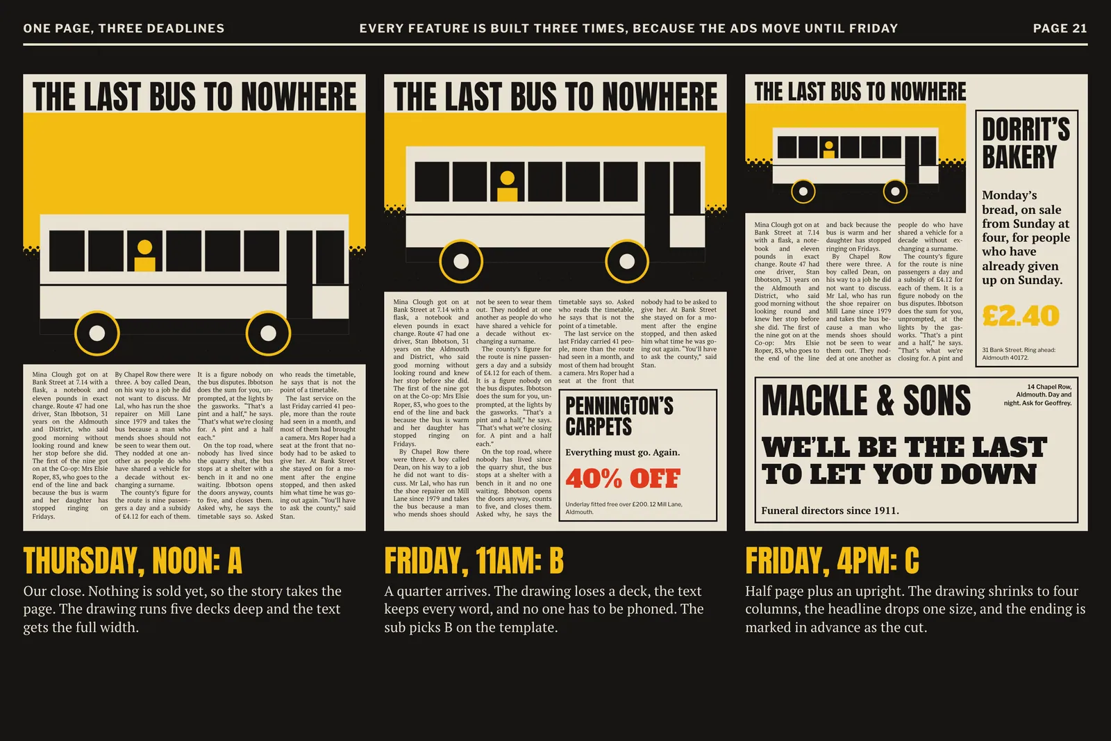
The illustrations changed most. We had no picture budget and no photographer, and photographs at 40 lines fill in. So I drew for the screen, in cut shapes of black and spot with coarse halftone doing the modelling. Black always overprints the spot and never knocks out of it, which hides the register drift. If the leek on the front looks like a linocut from 1936, that is the press talking.
I told Noor a headline isn’t a shape. Now I count on my fingers at weddings.
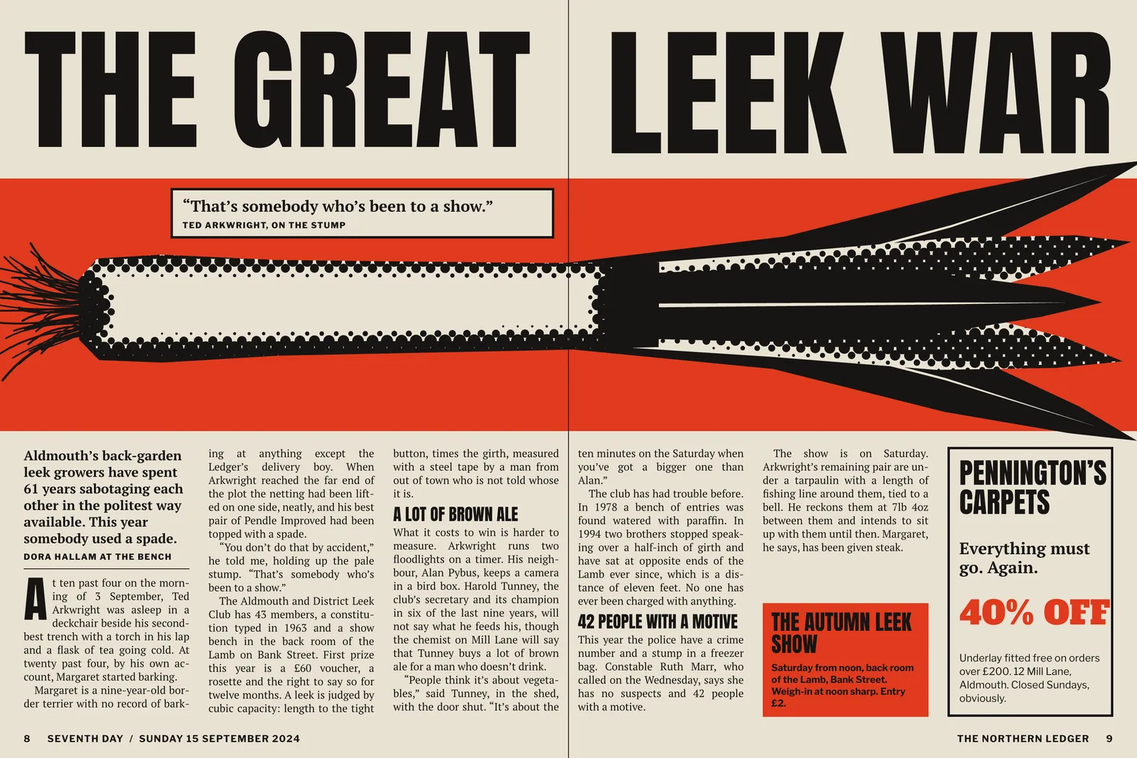
The Friday problem needed a system more than a style. Under the old arrangement a late ad meant Hanne redrawing a page at five o’clock while a sub cut copy down the phone. Fourteen times in 2023 a page went to plate with a hole in it or a story that stopped mid-sentence, and twice the printer re-plated at the paper’s expense.
I split the page into six columns and twelve decks, and ad sales agreed to sell only in those units. Then every feature gets built three times by Thursday noon. Layout A assumes no ad. Layout B assumes a quarter page. Layout C assumes a half plus an upright, which is the worst thing they have ever sold us. The drawing is made to crop at known lines, the headline has a second size already written, and Tom marks a cut in advance. On Friday, whoever is at the desk picks a letter. Nobody has to be phoned.
It sounds like three times the work. It costs about 40 minutes a feature, because the three layouts share one grid and one block of copy, and Hanne has her Friday afternoons back.
People had been opening the section from the back for forty years, so I gave them more to come back for. The crossword moved to a full page with a sudoku, a word ladder and the answers printed upside down, under the name The Long Sit Down. The listings became a real grid, drawn to scale at 15 minutes a row, so a three-hour western looks like three hours of your life. Dora Hallam watches what she can and prints the result in green.4
Then we added a page that had never existed: one chart, every week, on a subject no one had asked about. The first was Where the Sunday Goes, built from the diaries of 1,204 readers. A press like this offers very little to separate nine categories with, so the chart uses what is there: black, spot, two dot screens and two line screens. It became the most cut-out page in the section. We know because people post it back with corrections.
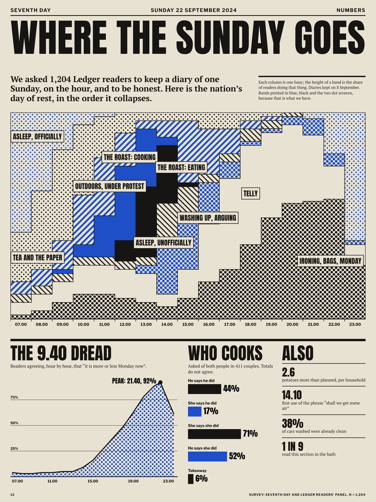
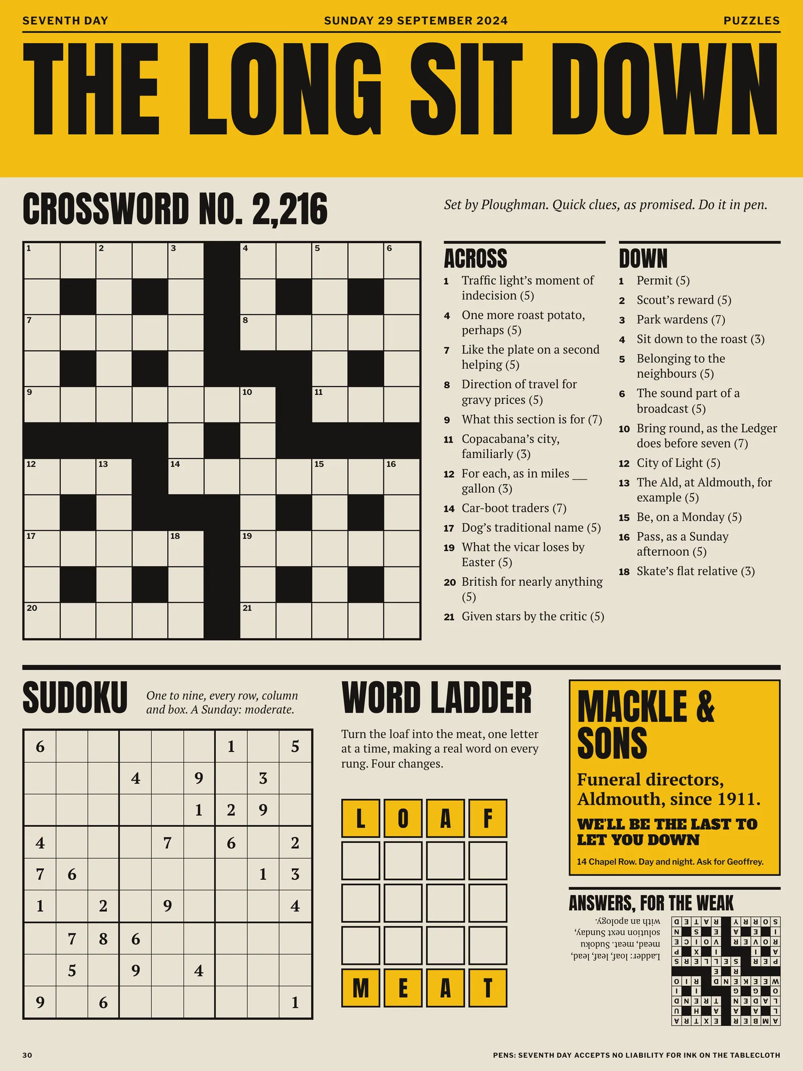
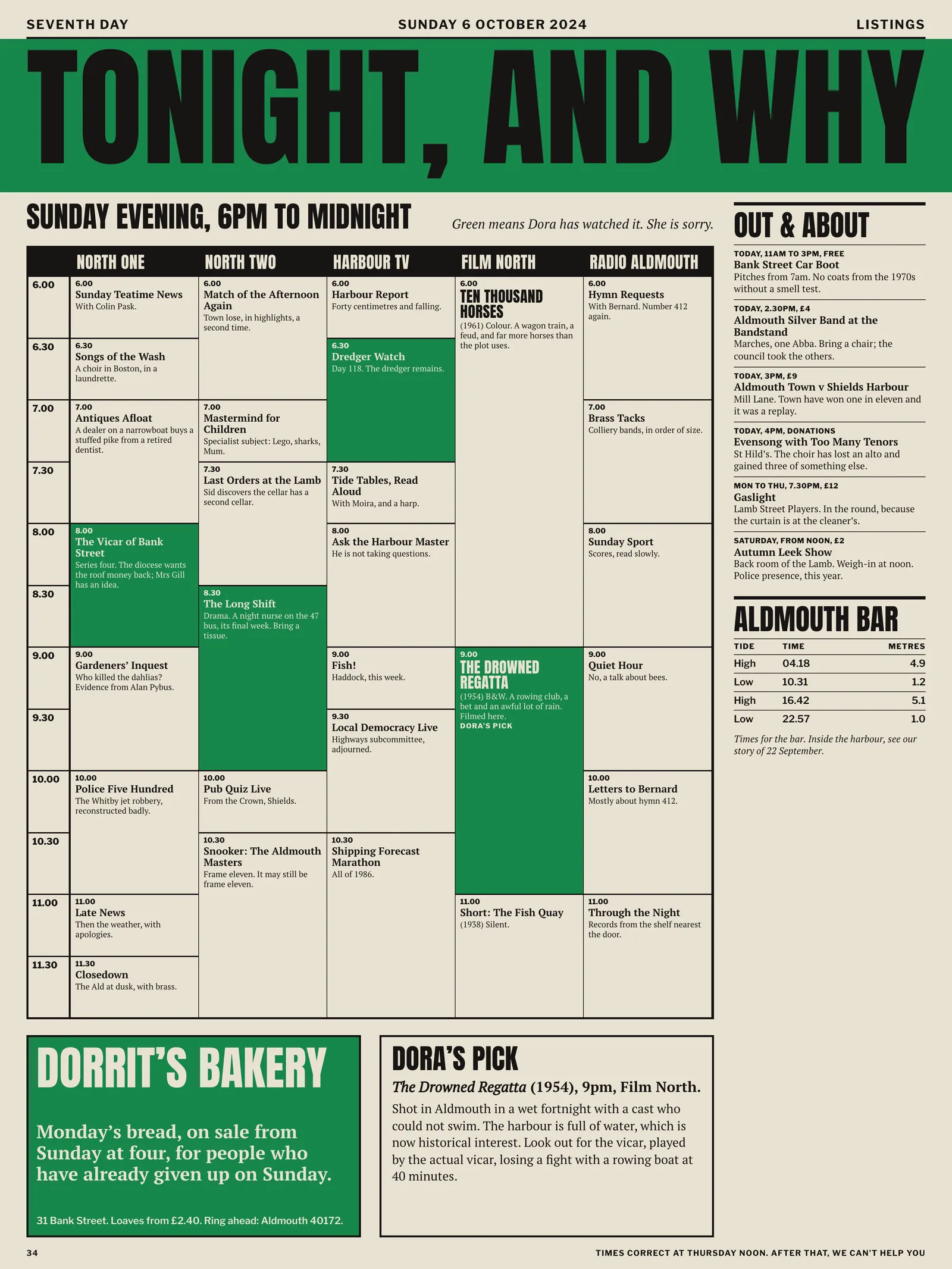
My husband now takes it out of the paper before I can get to it. There has been shouting.
The new section launched on 15 September 2024 with the leek war on the front. We had one bad Saturday, when the red came up orange on the first 30,000 copies and nobody complained. After 26 weeks the panel’s read figure had gone from 31 to 58 per cent. Sunday sales, which had fallen for nine years, rose 6.4 per cent and have held. The Friday system took in £212,000 of late advertising in its first year that the old process would have turned away, and pages going to plate with a hole in them went from fourteen to none.
I would change the Custard. Yellow on newsprint goes the shade of old teeth in damp weather, and we have since nudged it towards orange. The section is still three people. Hanne took her holiday in March.
Ends, page 71
Continued on page 72