Continued on page 90
Eighty-Four Films, Four Rooms and a Programme You Can Read in the Dark
No. 4,620, Sunday 8 November 2026
Feature, page 72. Food quarterly
With no money for a single shoot, an independent Lisbon quarterly built twelve issues on scissors, spot ink and a recipe page you can read from the chopping board.
Teresa Amaral cooked in a hospital canteen for eleven years. Duarte Lobo subedited a business daily until it closed. In February 2023 they came to my studio with €41,000 from a family loan and a flat plan for a 148-page quarterly about what people actually eat: canteens, packing sheds, works lunches, the soup nobody writes down. No restaurants, no chefs, no one photographed holding a fish.
I asked what they had budgeted for photography. They had not. I got a quote from a Lisbon photographer I trust: one day, with a food stylist, an assistant and the shopping, came to €3,800. A magazine of that length needs about twelve such days, so the pictures alone would cost €45,000 an issue. They had money for less than one.1
That settled the art direction before we had a typeface. Pith would have no photographs at all, and it would need to be more appetising than the magazines that did. The team was two people, plus me for three weeks a quarter and whichever illustrator we could persuade.
We asked what a food photograph costs. Noor said, about one issue. That was the whole art direction meeting.
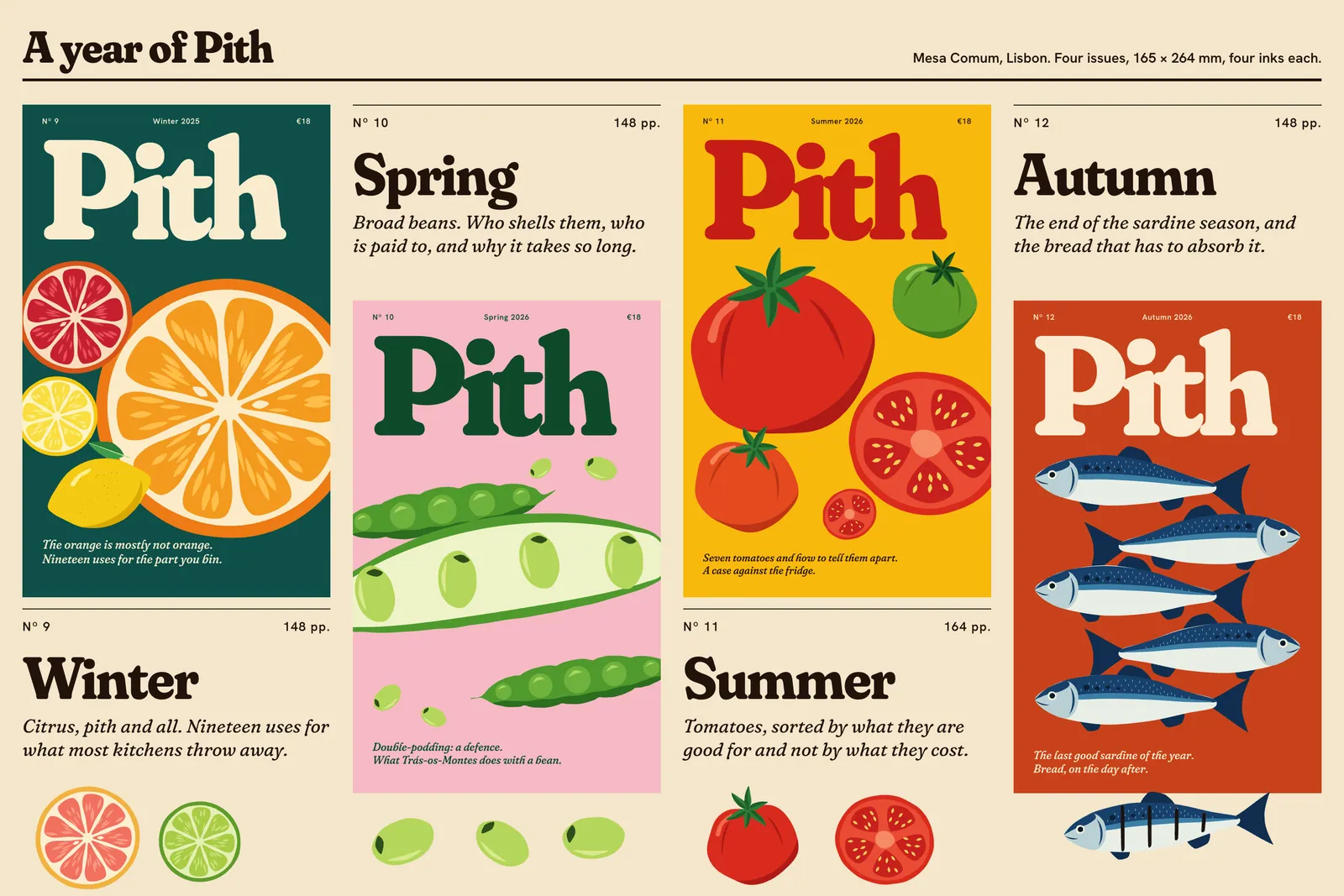
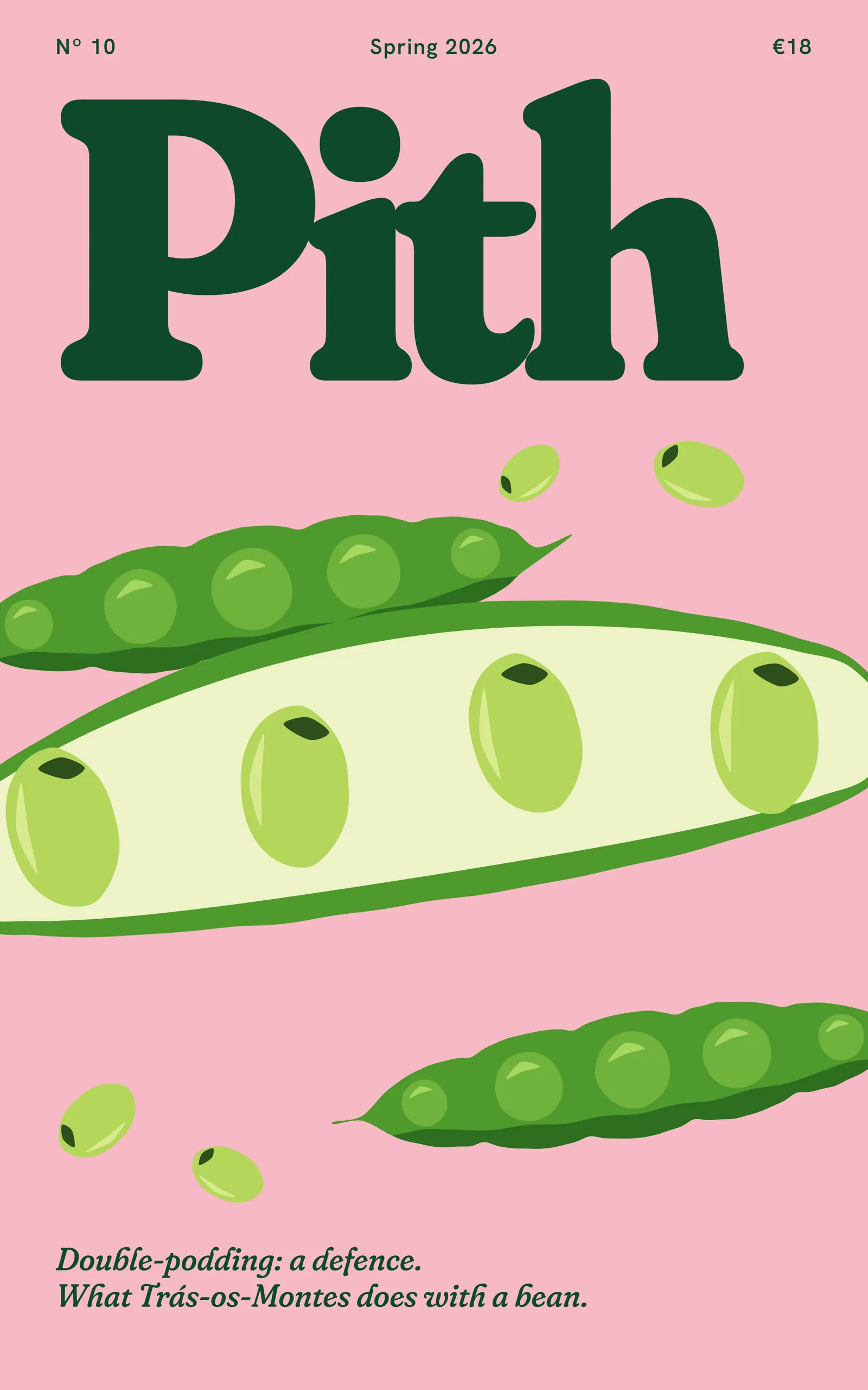
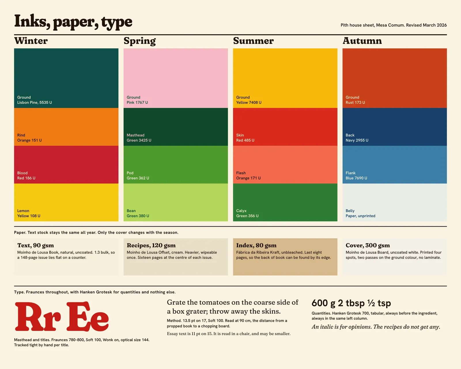
Independent magazines are sold face-out, on a shelf of other independent magazines, most of them pale and tasteful. We went the other way: four spot inks per cover, chosen for the season and owned by it, printed on uncoated white board with two passes of the ground colour so that it stays dense. The masthead is 462 points on a page 165 mm wide, because the word has to do all the work of a logo we could not afford to promote.
Each cover carries one ingredient at a size slightly too large for the format, and two lines of italic. No barcode on the front, no list of contents, no fourteen reasons to buy. The yellow of Nº 11 cost us an extra €600 at press and Duarte has mentioned it at every meeting since.
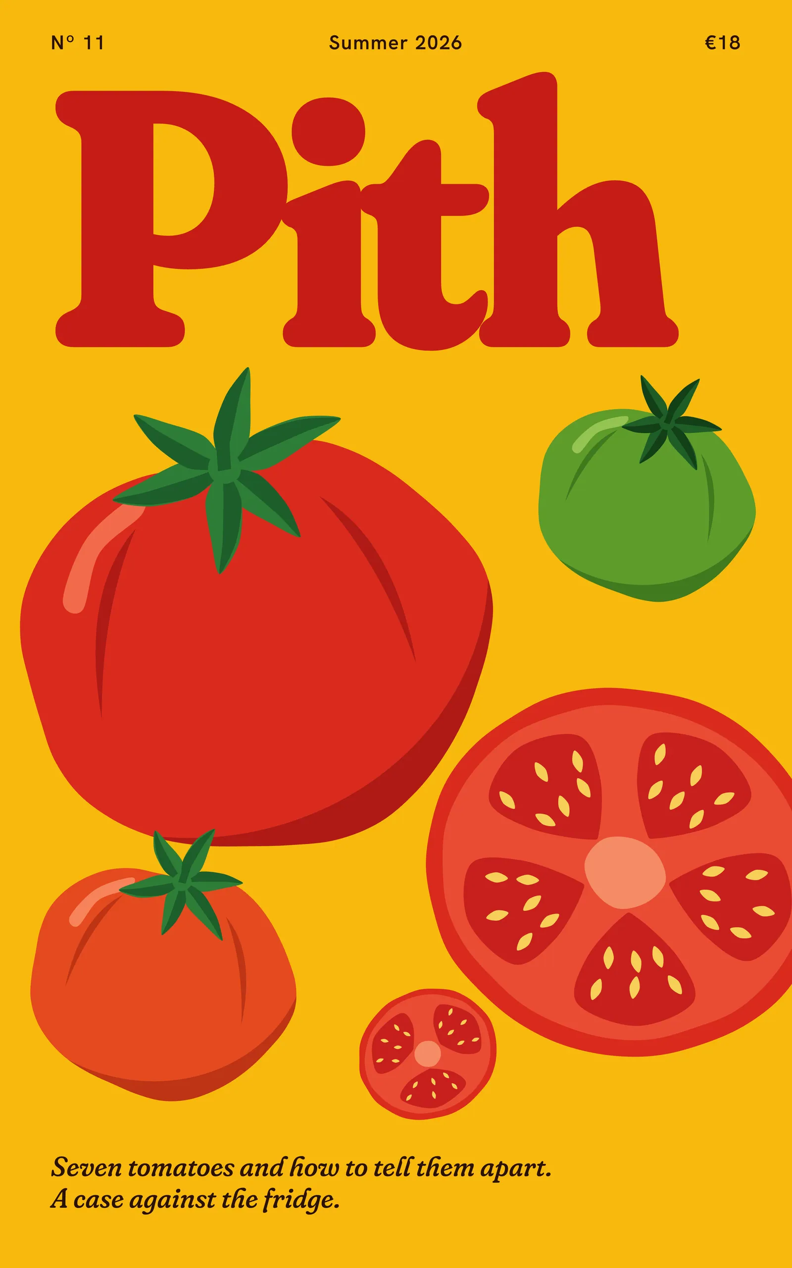
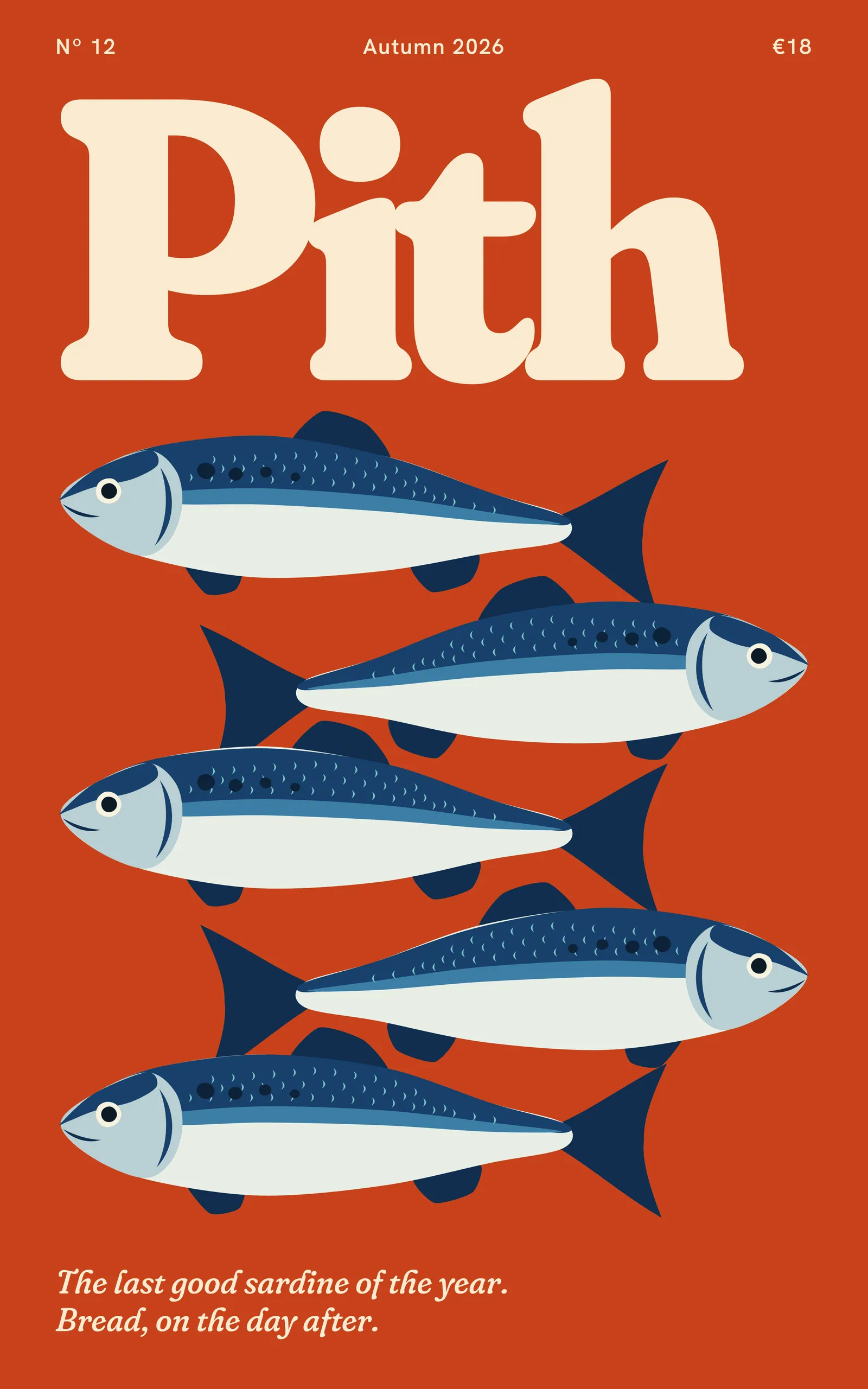
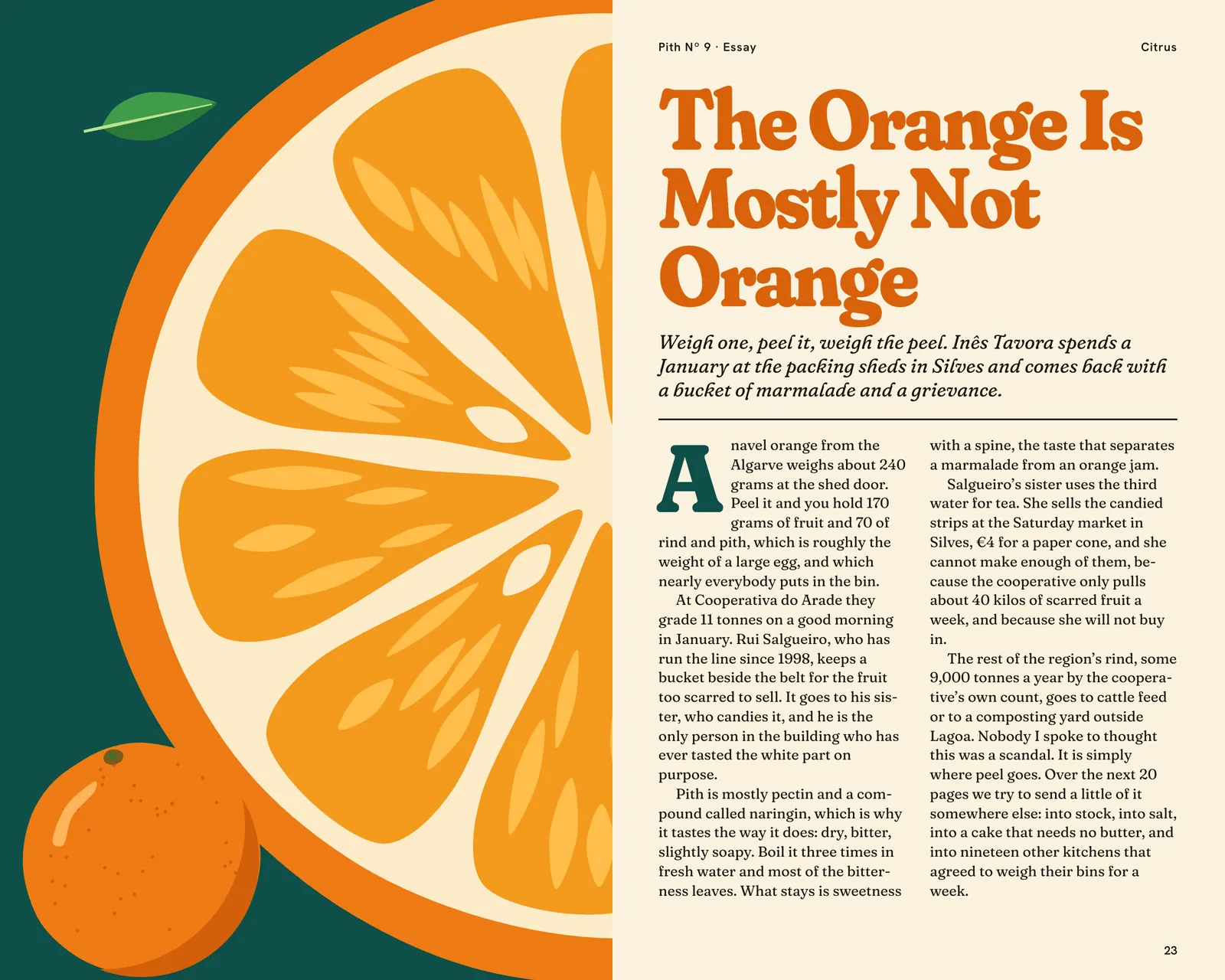
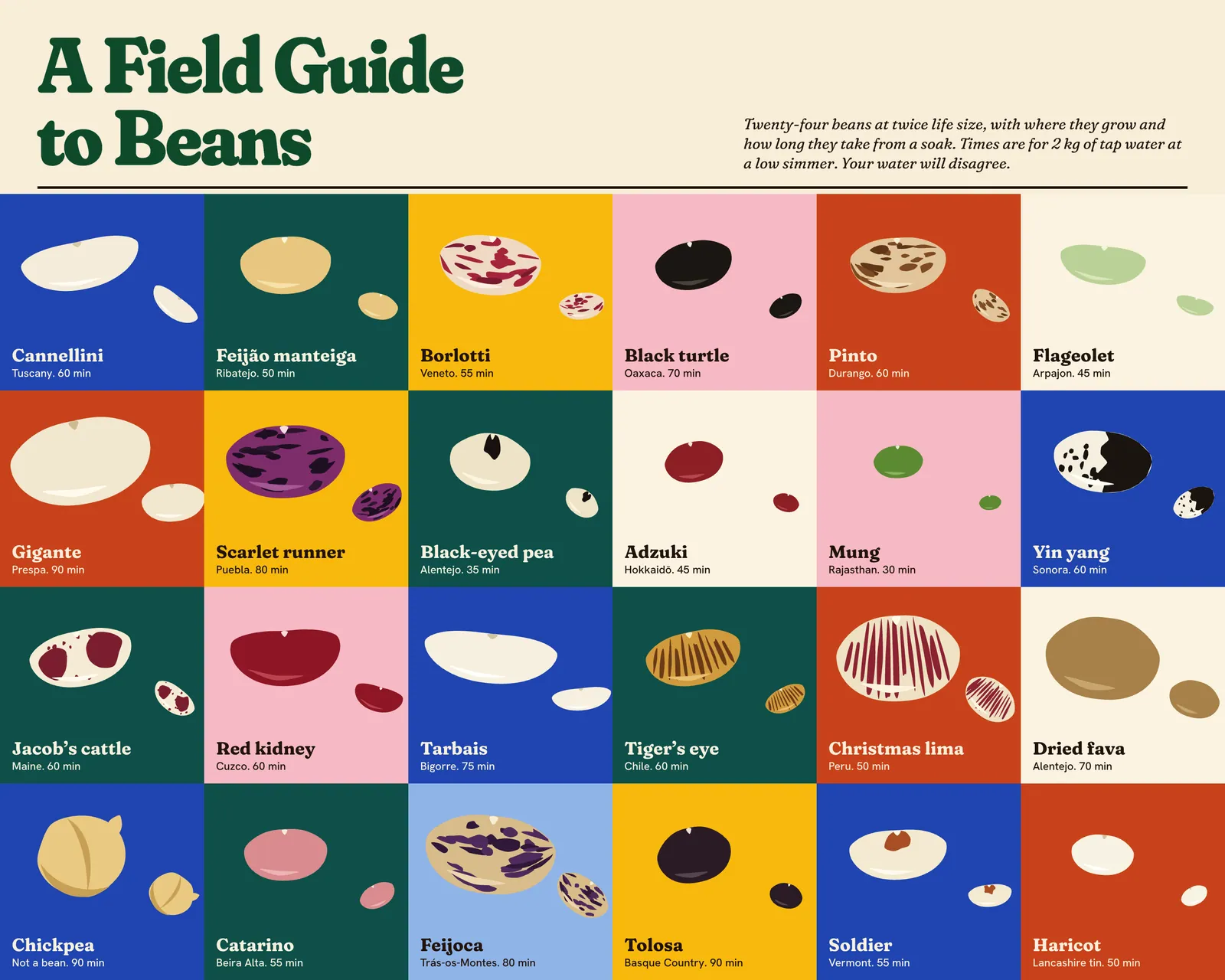
I tried three illustrators on the same brief: draw a lemon that makes me hungry. Line work looked like a cookbook from 1974. Digital painting looked like a stock image of a lemon. Marta Quintal sent back a lemon cut from four pieces of coloured paper with a scalpel, slightly wrong at one end, and everyone in the room wanted to eat it.2
Cut paper also solved the arithmetic. Marta cuts each object once, by hand, in about ninety minutes, then scans the pieces at 1200 dpi. I close the shapes and fill each one with a flat spot ink, so a tomato can change colour with the season without being redrawn. After twelve issues the library holds 340 cut objects, and an issue typically needs about thirty new ones. Illustration costs €2,100 an issue.3
A flat shape forgives nothing, so most of the craft went into silhouettes. A halved tomato only reads if its seed pockets are uneven. A fish only reads if its belly is left as bare paper.
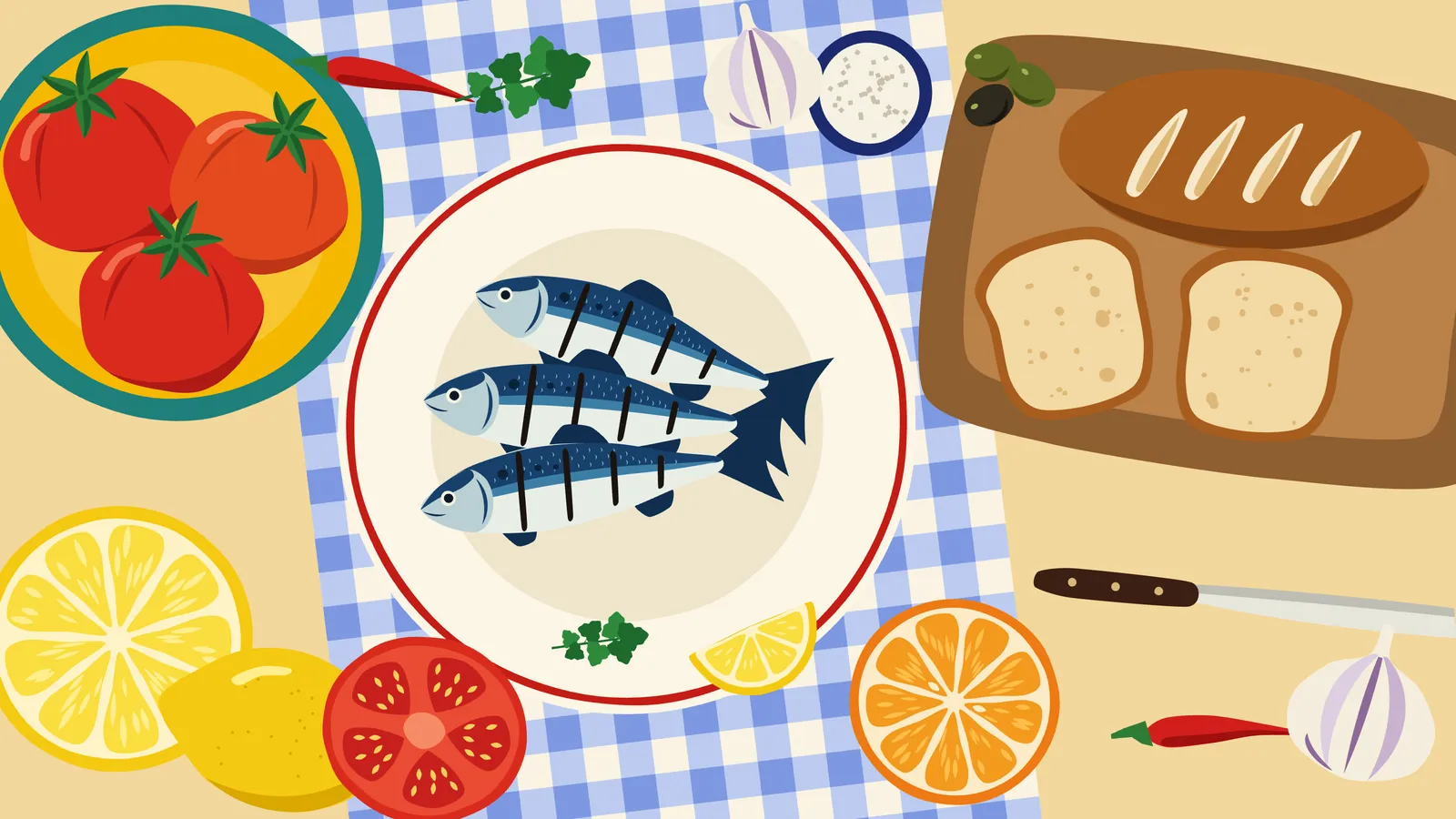
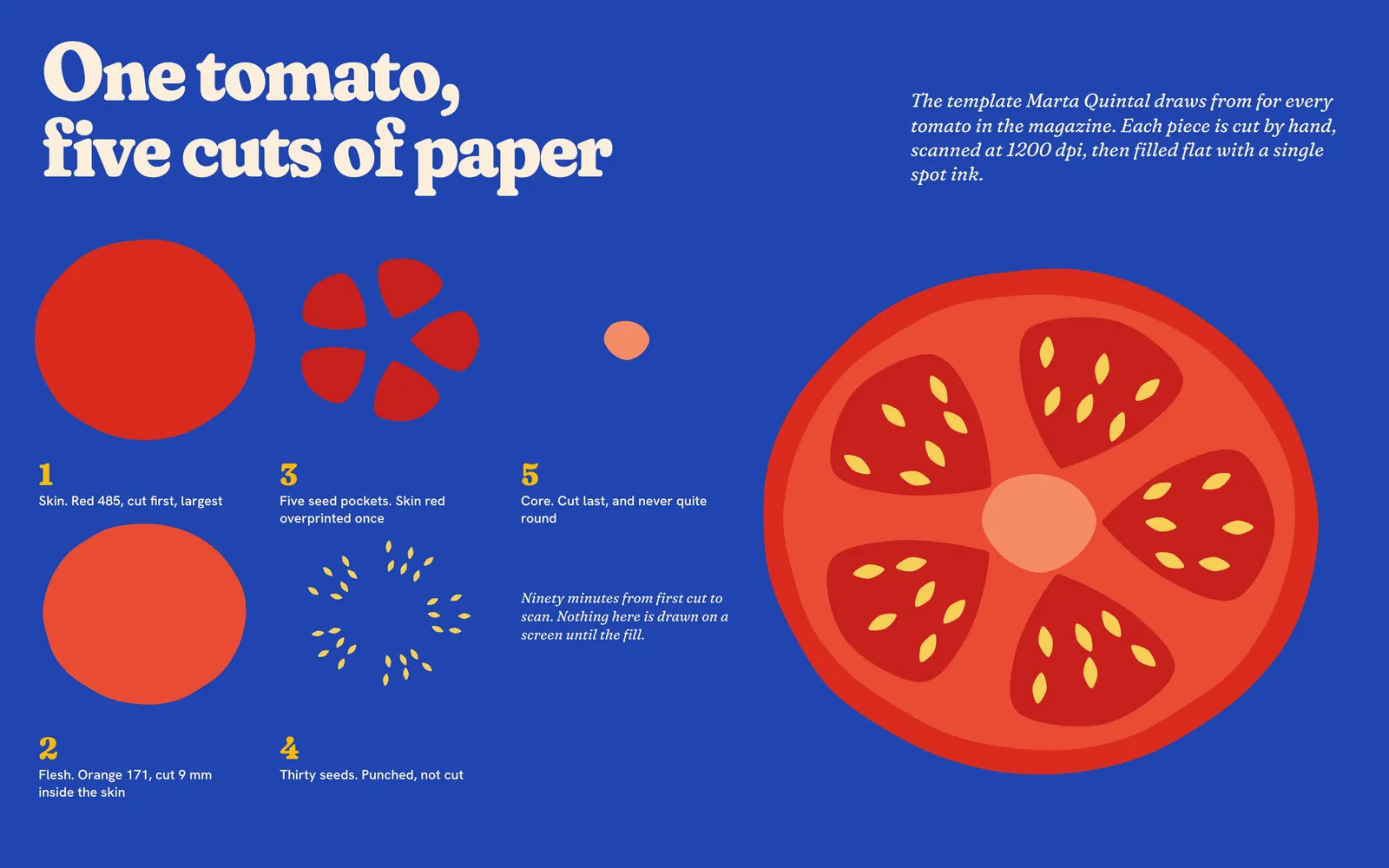
A tomato takes ninety minutes. The sardine took three weeks, because it kept looking pleased to see you.
A printed recipe gets read from the wrong distance, with the wrong hands. Most magazines set them at 8 or 9 points in a narrow column beside a large picture, and assume you have memorised the thing by the time the onions go in.
Before designing anything I printed one method at five sizes and taped them to the tiles in Duarte’s kitchen. He stood at his chopping board, 90 cm away, with flour on his hands and a pan going, and read each one aloud. He lost his place at 9 points, at 10, and at 12 in the light weight. At 13.5 on 17 he stopped squinting.
That size has consequences. A recipe now takes a full page, sometimes two, so the 16-page recipe section sits at the centre of each issue on a heavier 120 gsm stock that can survive being wiped once. Quantities are set in a sans serif in their own left column, always before the ingredient, because that is the part you look up with a spoon in your hand. The method never turns a page.
Helena Moura tests every recipe twice in a domestic oven, and we print what she found, including the failures. The italic is reserved for opinion. If a line is in italic you may ignore it, and the food will still work.
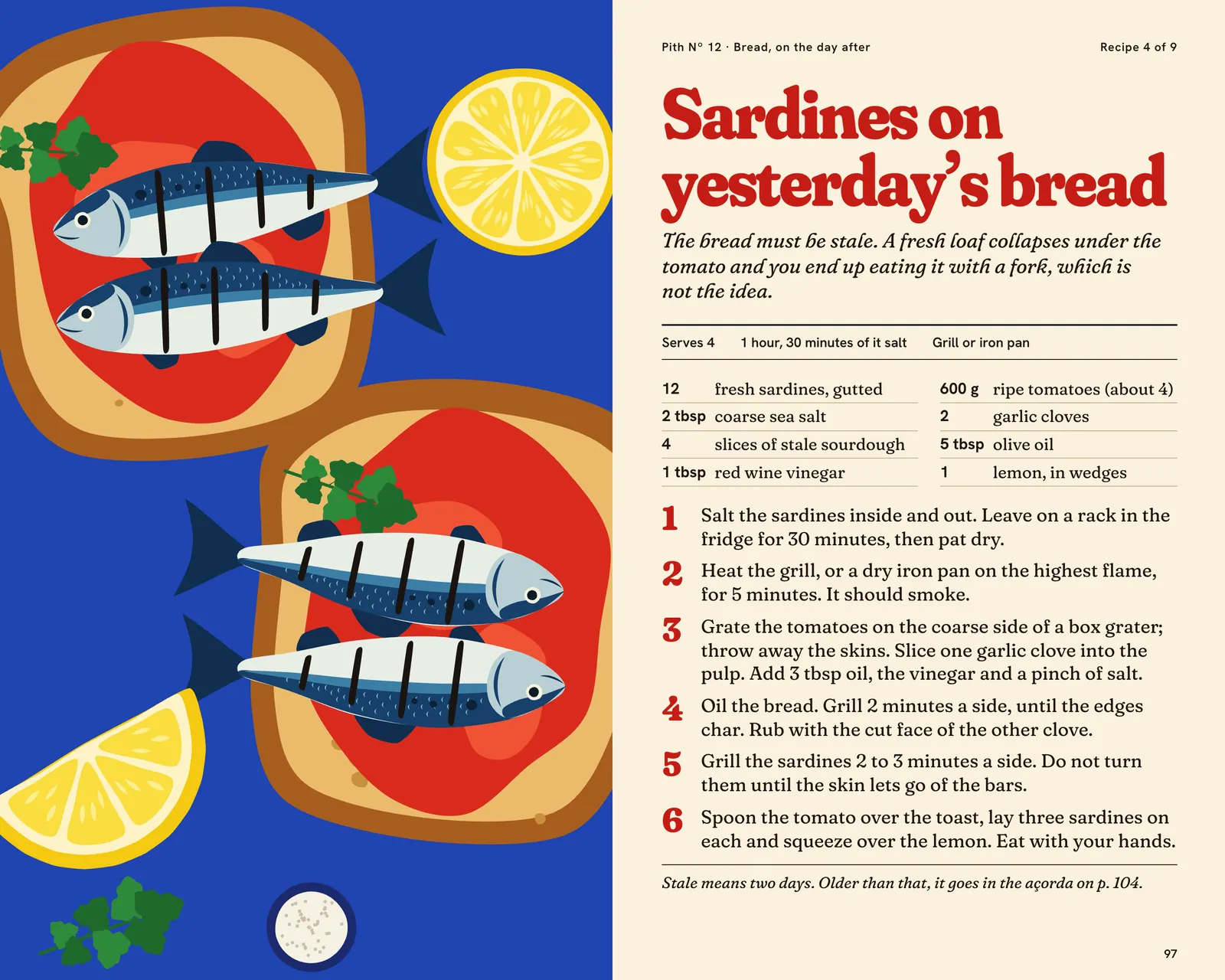
Everything is set in Fraunces, with its softness axis at maximum for titles and method.4 Soft serifs suit uncoated stock, where ink spreads and sharp corners turn fuzzy anyway, and the wonky italic has the slightly overfed quality I wanted from the start. Hanken Grotesk appears only for quantities and folios.
The format is 165 by 264 mm, tall enough for a column of method and narrow enough to prop against a backsplash. Sections are thread-sewn on a 1.3-bulk natural text stock, so an open issue stays open on a counter without a jar on it.
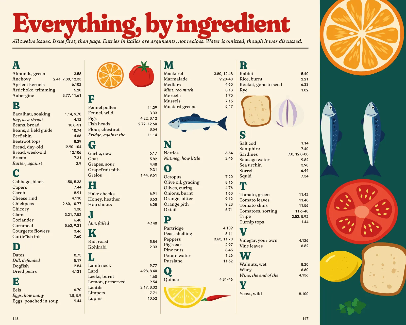
The last eight pages are unbleached kraft and hold a cumulative index of every ingredient in every issue, reset each quarter. It began as a way to use up the end of a signature. It is now the most-mentioned page in reader letters, and the reason people keep buying the back issues.5
Nº 1 appeared in December 2023 in a run of 3,500. Nº 12 printed 11,200, sold in 140 shops across nine countries, with 4,060 of them going to subscribers. Issues 1 to 7 are out of print. In last year’s reader survey, 62 percent of respondents had cooked something from the latest issue within a week of buying it, which is the only number Teresa has ever asked me to frame.
The magazine has never run a photograph. We have been offered several, for free, and said no. Two people still make it, and the method has outlived one printer and a change of paper mill without anyone needing to redraw a tomato.
Ends, page 89
Continued on page 90