Continued on page 4
A 61-Year-Old Monthly Sheds Five Typefaces and Finds New Readers
No. 4,620, Sunday 8 November 2026
Feature, page 90. Film festival programme
A river-town festival asked for a pocket book a stranger could use in a queue at night, with a timetable that kept moving until two days before press.
Beatriz Lobo has directed Margem for seven of its twelve years, and she opened our first meeting by putting the previous programme on the table with a phone lying on top of it, torch on. That, she said, was how the book was read. The festival happens in Alvarim in October, when the sun is down by seven, and its four rooms are spread along a river with no foyer worth the name.1 People stand in a queue on the quay and try to work out whether they can make the 21:30 in the grain store after the film they are about to see.
The old programme was a 148-page A5 paperback, handsome on a desk, with essays at the front and the timetable on page 112. Her brief fitted on one line of a text message: a book a stranger can use in the dark in a queue. I took the job on the condition that the essays could go online.
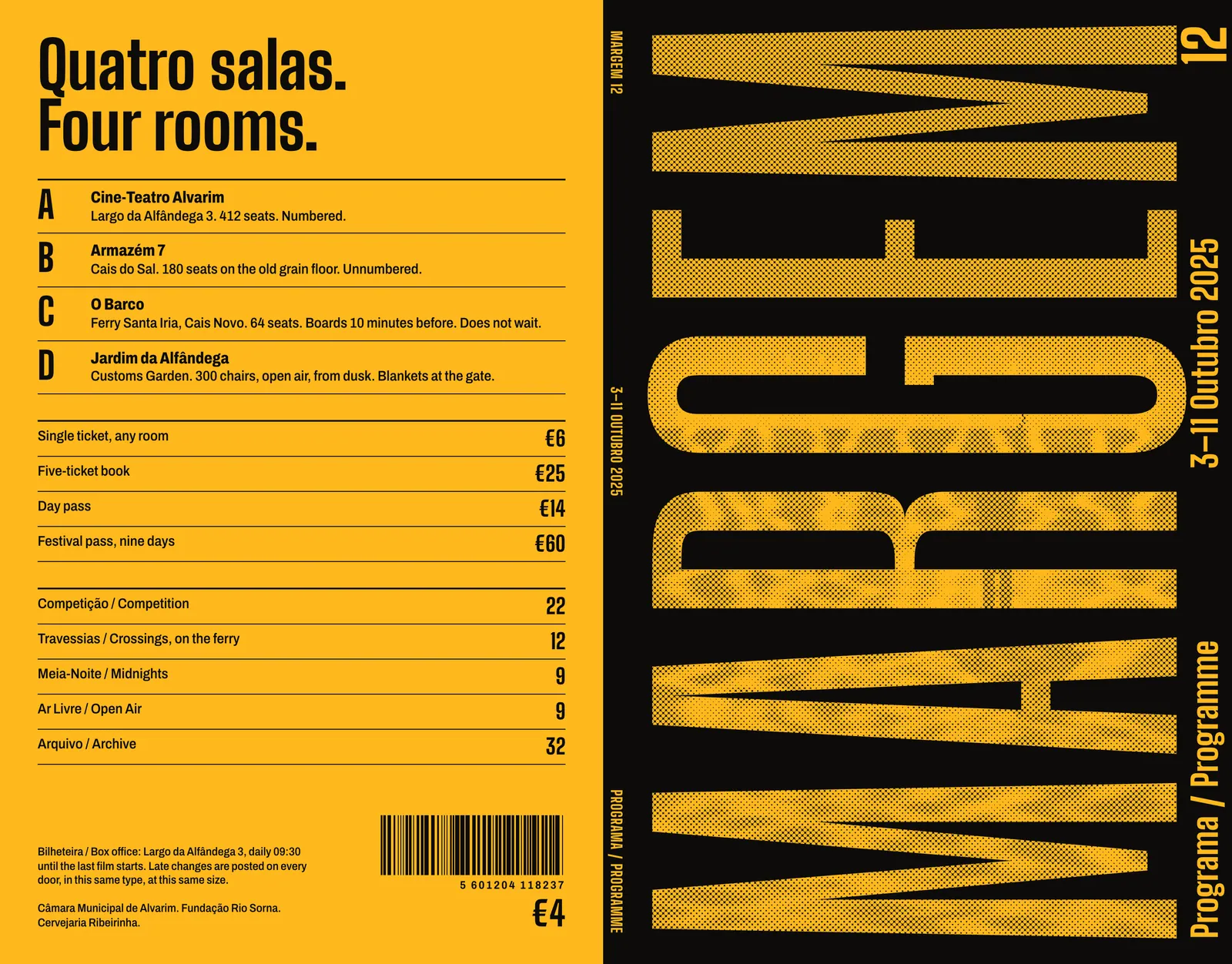
The budget allowed 7,500 copies at €1.84 each, which meant six sixteen-page signatures on one uncoated stock, saddle-stitched, in two inks. Ninety-six pages had to hold 84 films, 168 screenings, nine days of timetable, a map, and the sponsors the festival is contractually obliged to thank. The trim came from a coat: I measured the outside pockets of eleven coats belonging to festival staff, and 115 × 180 mm fitted ten of them.
The harder constraint was time. Films at Margem arrive as 35 mm prints on loan from archives and distributors, and their dates move. In 2024 the timetable changed nineteen times in the last month. Lobo could promise me a frozen list two days before plates and nothing earlier. Whatever I designed had to absorb a late change without anyone reflowing a page at midnight.2
So I started with a test in place of a layout. On a September evening we set up on the quay at about eight lux, roughly a street lamp at a distance, and asked passers-by to find a named screening in the 2024 book. The median was 31 seconds, and several people gave up. That number became the only metric I reported to the board.
I do not need it to be beautiful in the shop. I need it to work when somebody’s partner is already walking away.
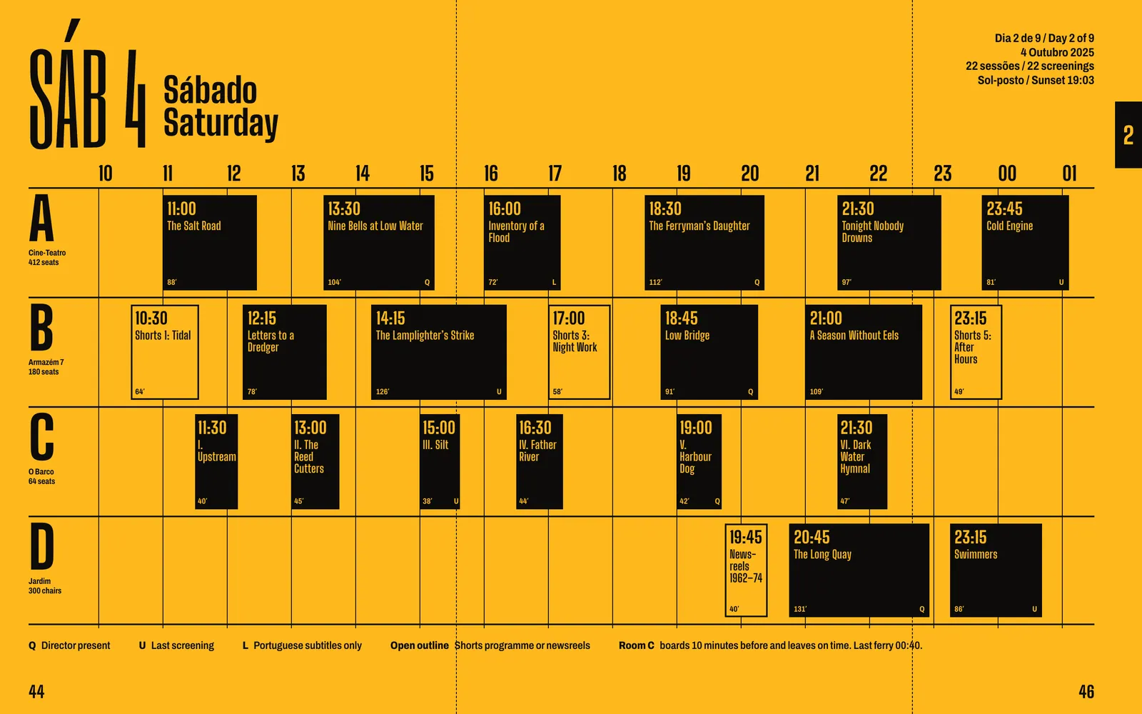
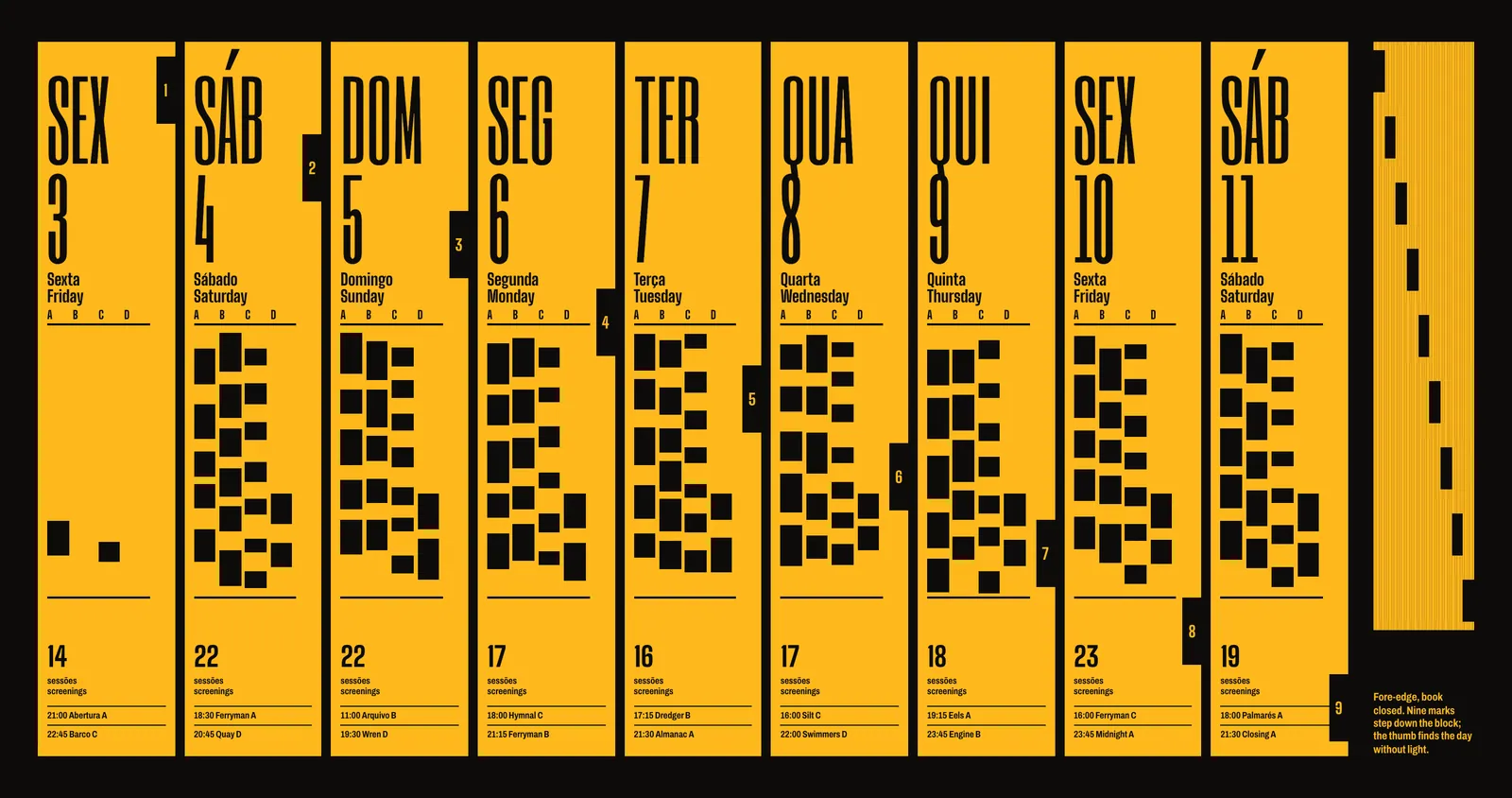
Every earlier Margem programme listed screenings in columns of text, one column per room. Readers had to do the arithmetic themselves to see whether two films overlapped. I drew each day as a chart with four rows, one per room, and with hours running across the page. A block is as long as its running time. Lateness, gaps and clashes are visible without reading a word, and I set the start time larger than the title, at 13 point, because the time is what people are looking for.
A chart of fifteen and a half hours will not fit on a 230 mm spread at any size you could read outdoors, so each day opens on a 58 mm gate, half a page wide, that folds back into the book. The nine gates took a long argument with the printer about imposition and added €0.11 a copy.
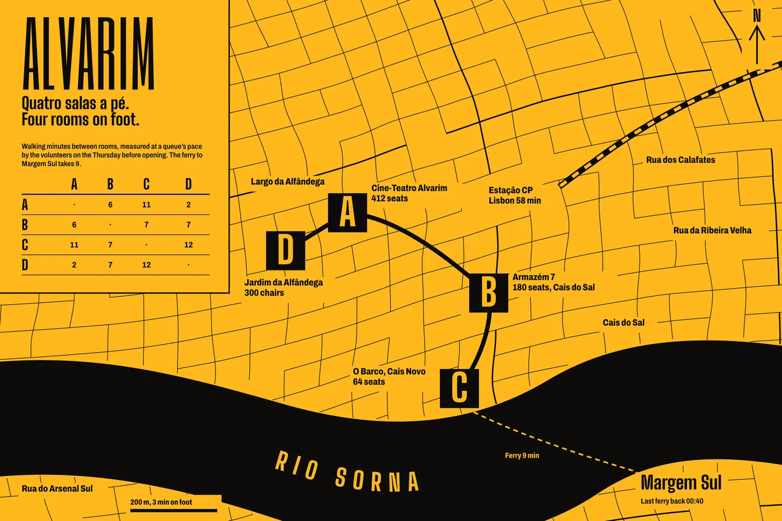
The timetable section prints as a solid of Pantone 1235 with black on top. I tested white stock on the quay as well. White read slightly faster under a street lamp and much worse under a phone torch, where it glared, and it left people squinting when they walked into a dark room. Amber also marks the section on the closed book, so nobody has to look for it. Rooms became letters, A to D, printed huge at the start of each row and painted on each door by a signwriter at the height of a head. Nobody at Margem now says “the grain store” to a stranger.
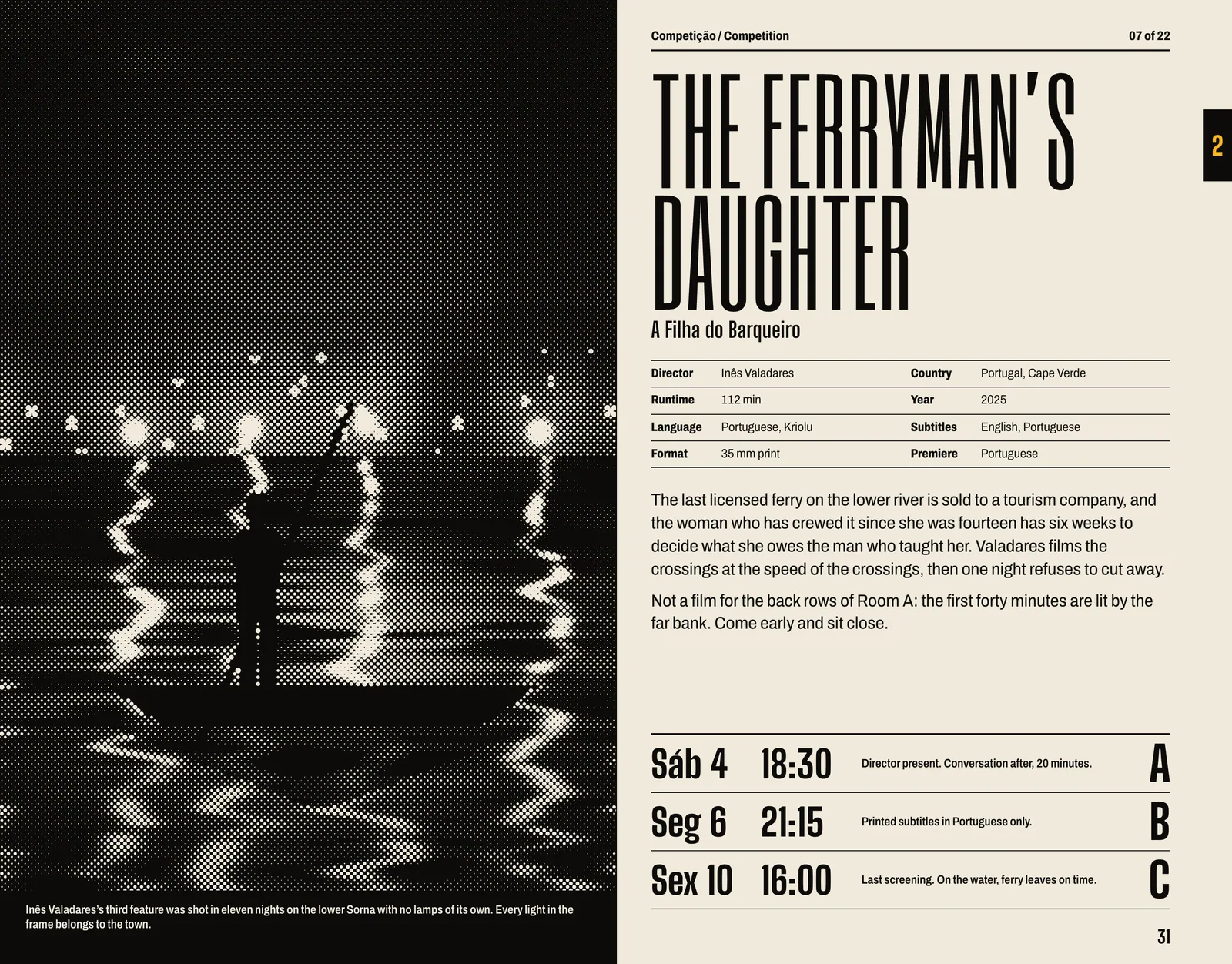
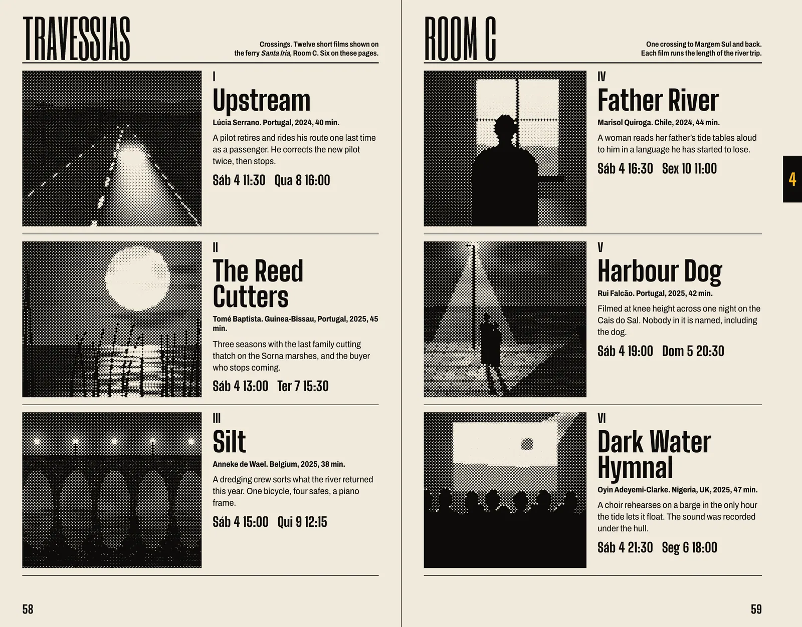
Screenings live in one spreadsheet, kept by the programmer, Vasco Teixeira, and nowhere else. A data merge writes every chart and every film entry from that sheet. The entry layout reserves exactly three screening lines at the foot of the page, whether a film plays once or three times, so a changed time can never push a synopsis onto the next line. A full rebuild of 96 pages took four minutes on my laptop.3 Teixeira sent the last change 41 hours before plates, swapping two films between Rooms B and C, and we ran it while he was still on the phone.
The stills came from 84 productions in every state: 4K masters, festival-kit JPEGs, one photographed from a monitor. I screened all of them through the same coarse 45-line dot, black only, on purpose. On uncoated stock a fine screen goes to mud, and at 45 lines a phone snapshot and a scan of a print end up belonging to the same book.
To find a day without opening the chart, nine black marks step down the fore-edge, one for each section, with the day number reversed out. Closed, the book shows a staircase. The thumb learns it by the second evening.
By the second night people had stopped asking me where anything was. They asked me where to get a sandwich, which I also know.
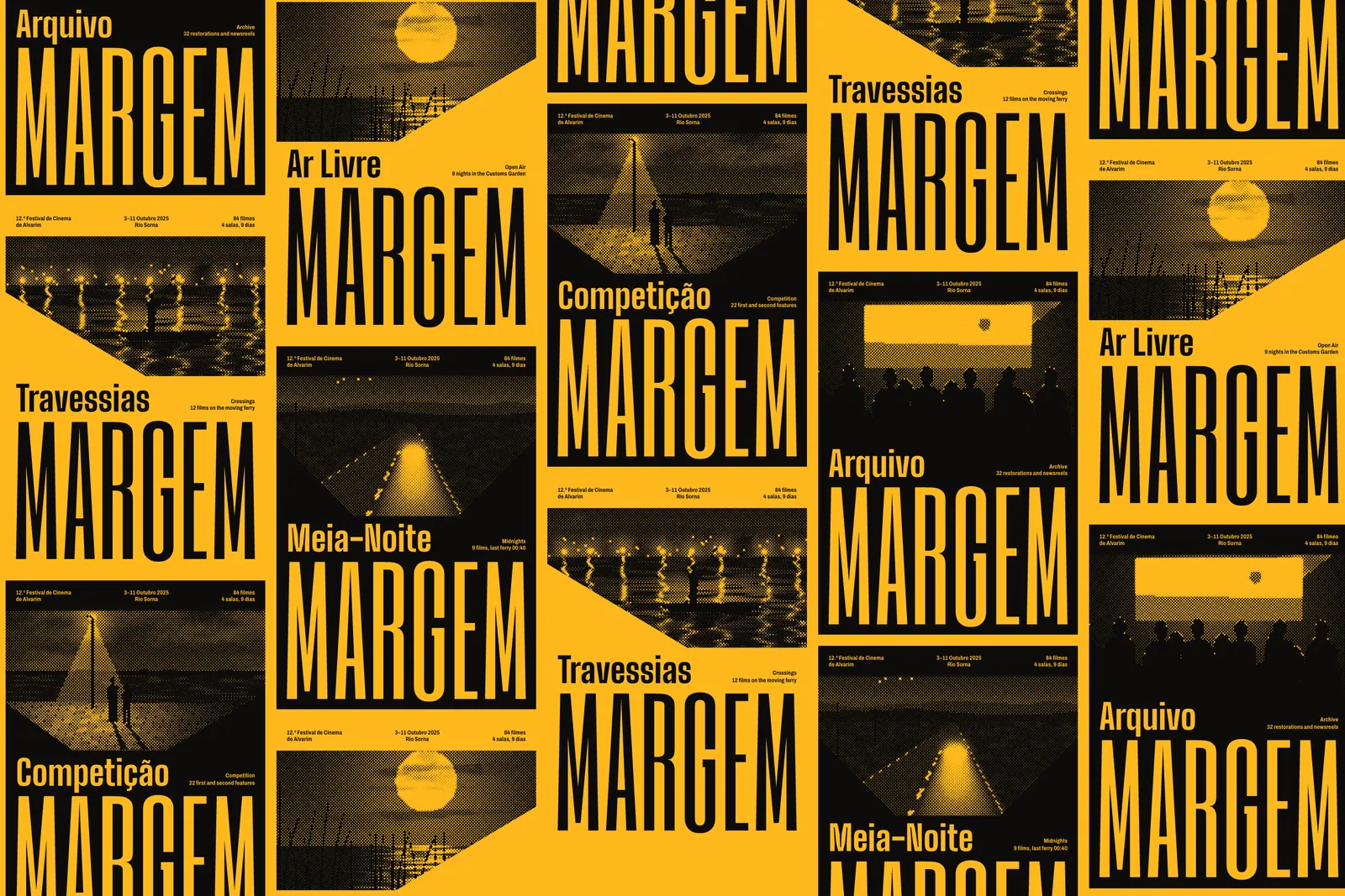
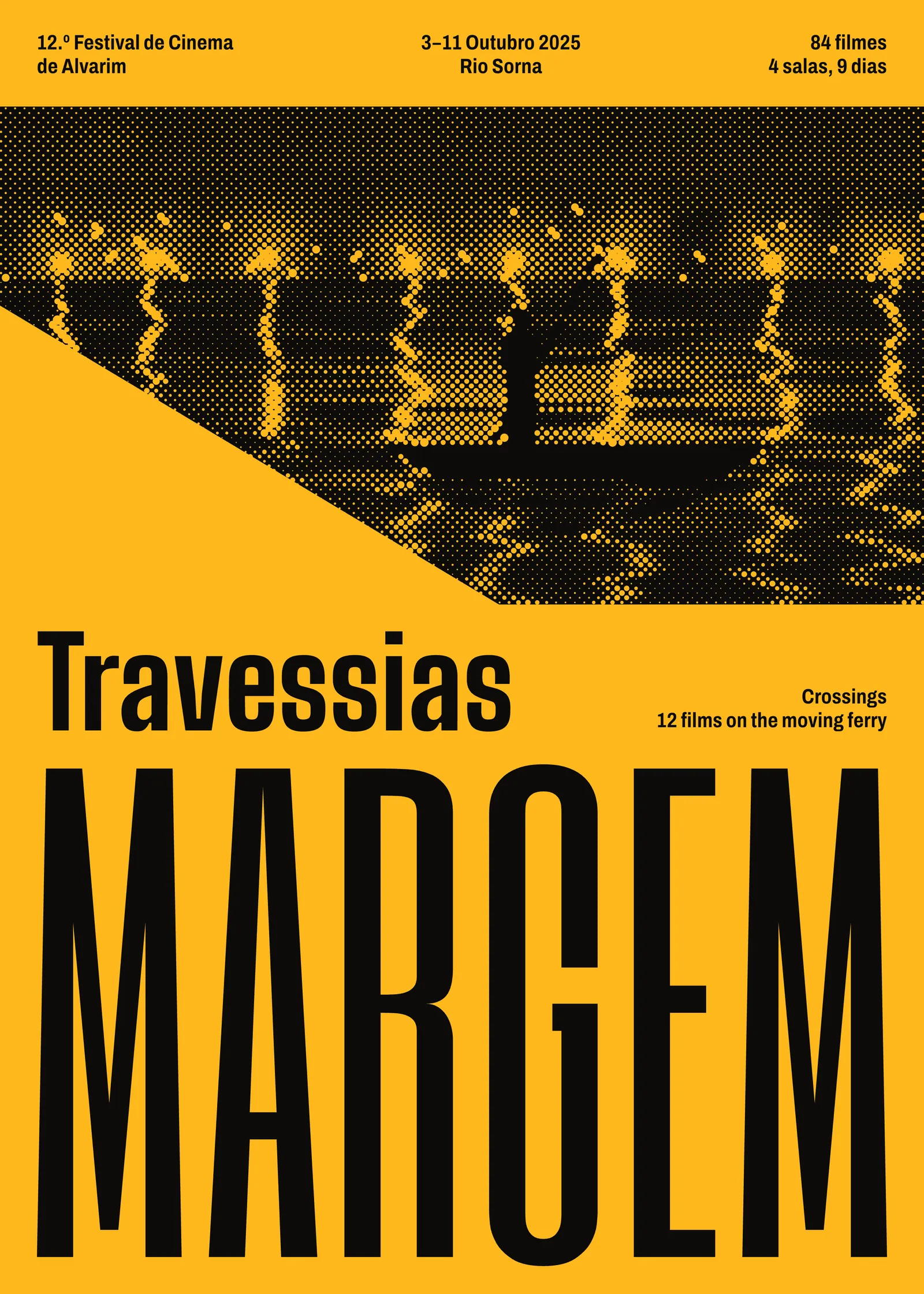
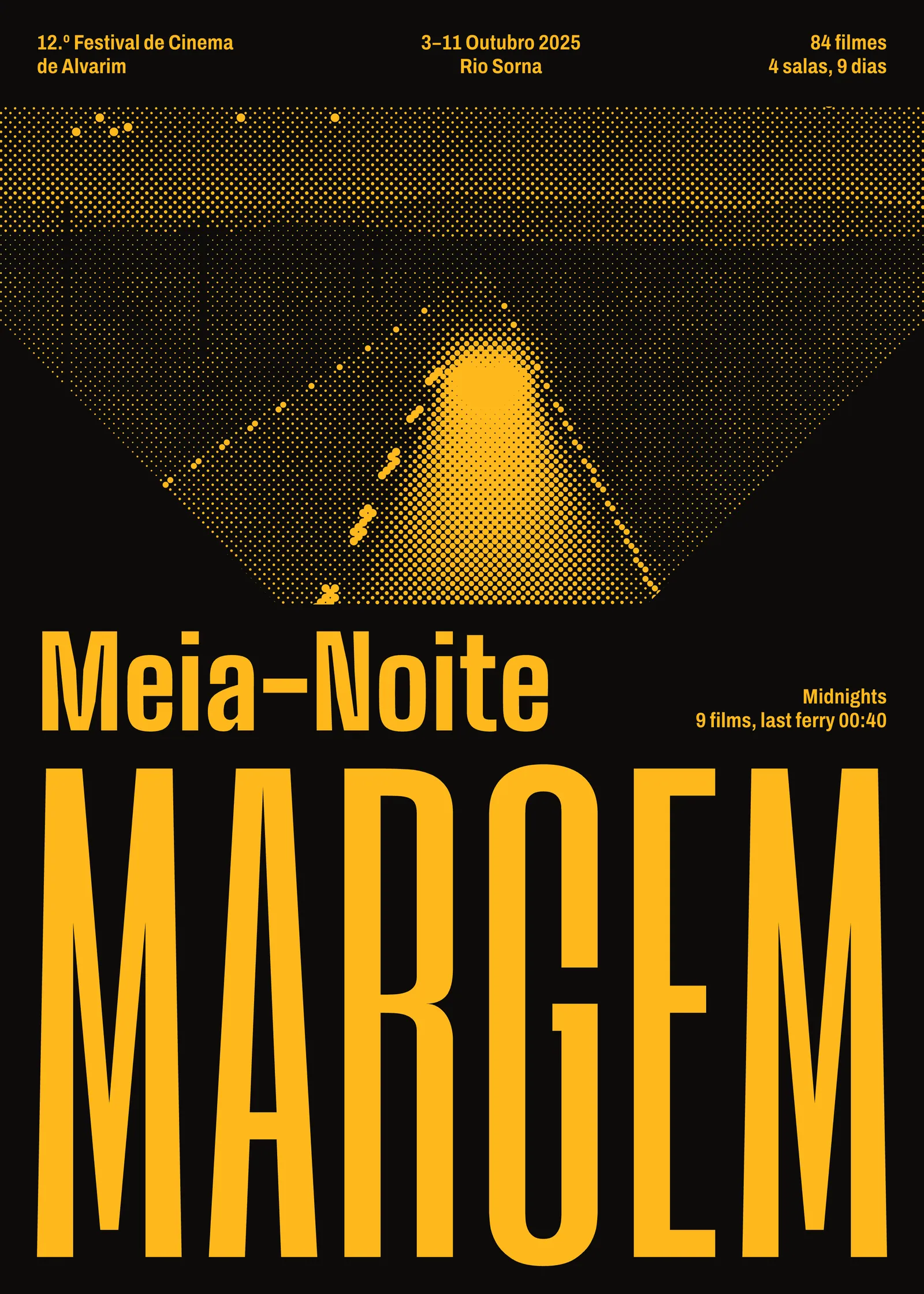
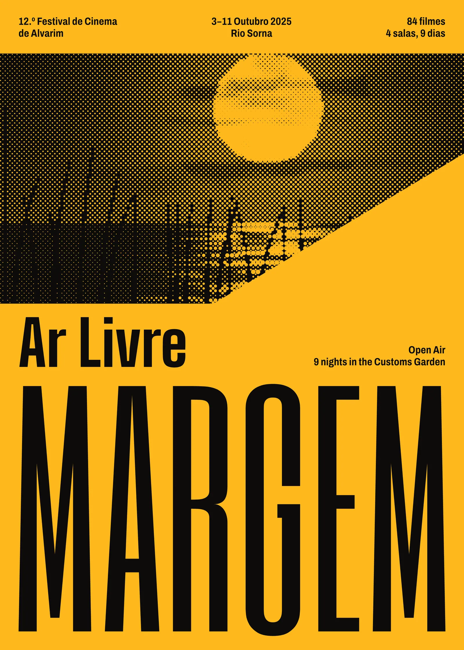
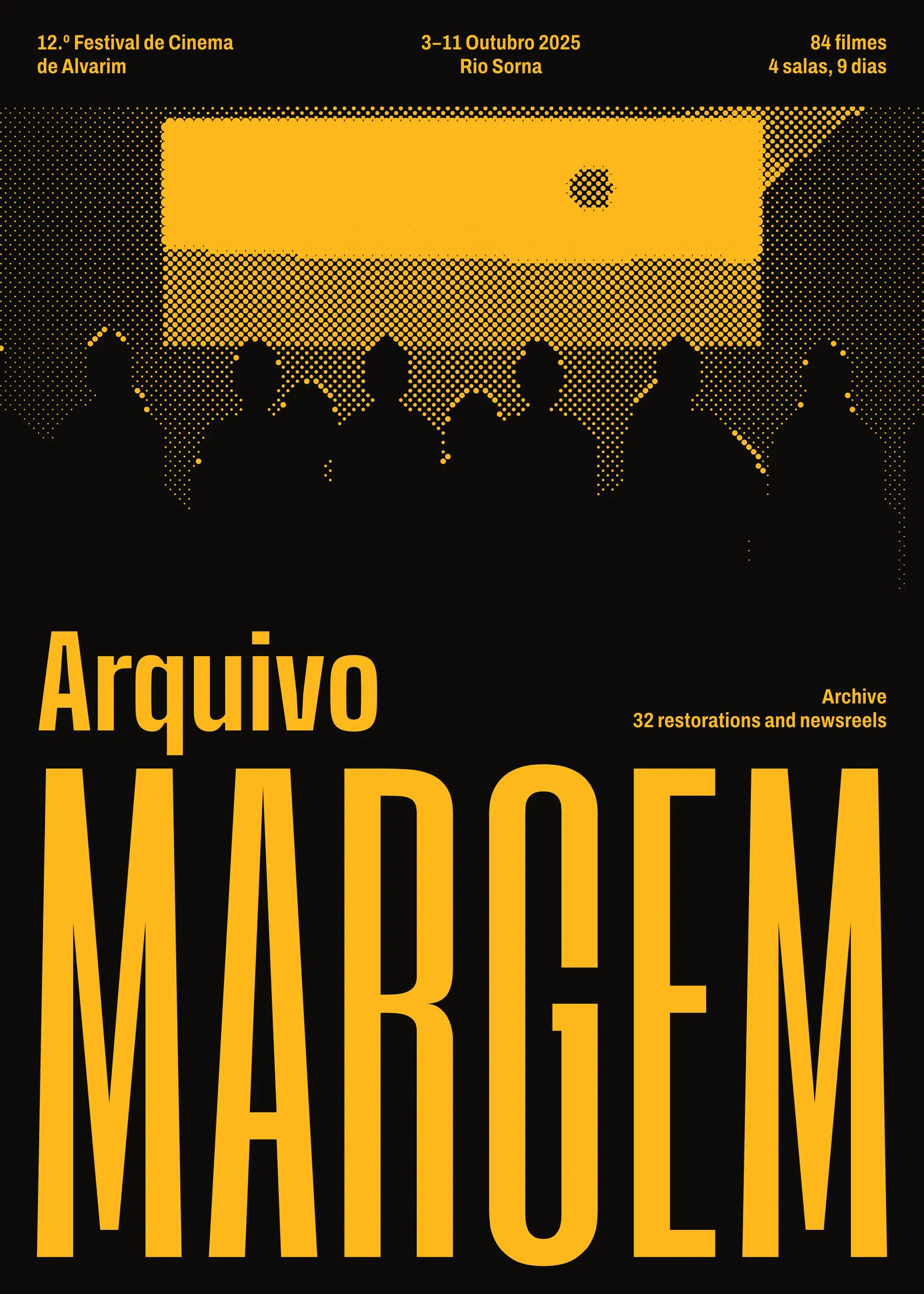
The identity follows from the same economy. Margem means bank, or margin, so the type goes to the edge and the picture is what is left. Each of the five section posters has a shape of projected light cut into it, a different angle for each, with a night scene from that section’s films printed inside in amber dots. MARGEM takes the lower half in Six Caps, which is about as tall and narrow as a Latin alphabet gets and holds up well at 700 × 1000 mm. Headings are in Big Shoulders and text in Archivo. All three are open-licensed, which matters: festival staff set their own late-change notices and signs, and they should not need my licence to do so.
The ident runs before all 168 screenings, so I kept it to ten seconds and took out the sound. Four rooms have four sound systems, and one of them is on an engine. It opens on a slit of light, the same shape as the posters’ apertures, and it closes the same way.
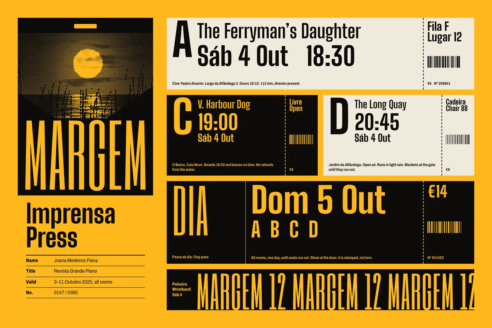
We repeated the quay test on the second Saturday of the festival with the new book, on people who had not yet opened one. The median fell from 31 seconds to 11, and nobody gave up. The box office keeps a tally of questions on a clipboard, and questions about where and when fell by 61 percent on the 2024 figure. Three screenings moved after the book went to press, and each was posted on the room’s door in the programme’s own type at the programme’s own size.
The print run sold through by the first Tuesday, which had not happened before, and the festival ordered 1,200 more from the same files. Lobo has asked for the same book next year with a new colour. I have told her the amber stays until someone finds a better one on the quay.
Ends, page 107
Continued on page 4