Continued on page 22
Twelve Forgotten Novels, Two Inks Apiece and a Budget of 38 Cents
No. 4,620, Sunday 8 November 2026
Feature, page 4. Magazine redesign
How a Lisbon magazine of ideas and the sea changed everything a reader can see while keeping its press, its paper and its subeditors, in four weeks and without missing an issue.
Halyard has come out every month since March 1964, through a revolution, two owners and a fire at the printer. When Beatriz Noronha took over as editor in 2023 she sent me a single page. It said that nobody under fifty was reading the magazine, that its subscribers renewed out of loyalty, and that the design was doing nothing for either group. She wanted a magazine her oldest readers would recognise by the second page and a stranger might pick up from a kiosk.
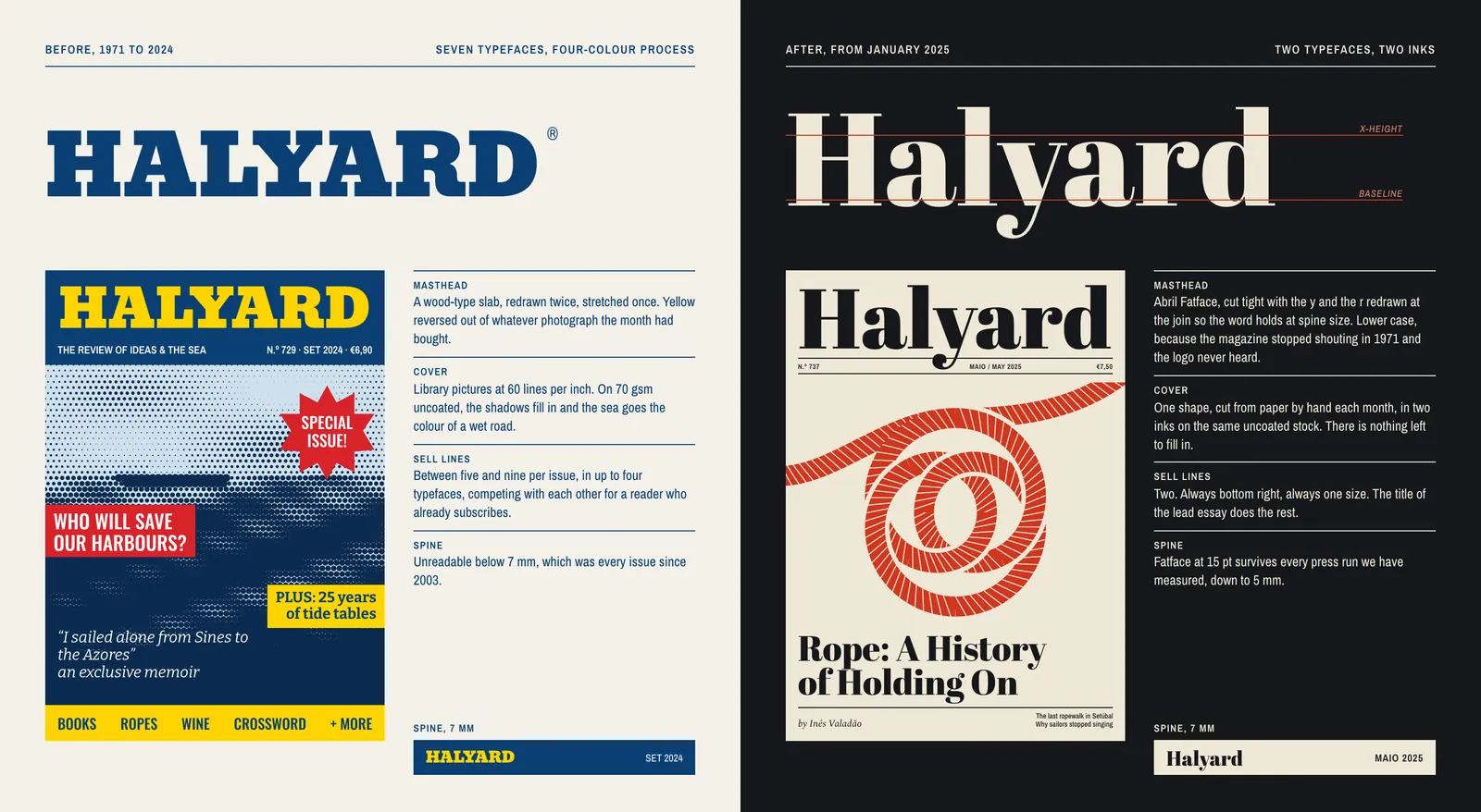
The issue I was handed had seven typefaces, a wood-type masthead stretched to fit the page,1 and nine sell lines competing for the attention of people who had already paid. It had the contents of a good literary monthly and the manners of an airport magazine. Inside, the essays ran at 8.6 on 10 points, on a grid that had been adjusted over the years by whoever happened to be on shift.
Four things were fixed. The magazine prints on the same web-offset press at Gráfica do Barreiro, on the same 70 gsm uncoated paper, under a contract that runs to 2029. A heavier stock would have added €0.31 a copy, which is most of the margin. There was no money for photography: the picture-library line, about €9,400 a year, was the first thing the publisher cut when he heard the word redesign. The eleven subeditors would keep their jobs and their InDesign, with no training budget and no fewer pages to get through.
And the changeover had four weeks. The December issue closed on 29 November and the January plates were due on 27 December. A monthly cannot skip a month, so readers would get the old magazine in one and the new magazine in the next.
The paper decided the most. Seventy-gram uncoated stock drinks ink. Halftone shadows close up, hairlines break,2 and in a good light you can read page 14 through page 13. I spent the first fortnight of the project with a loupe and a stack of back issues, measuring what had survived the press, and wrote the results on one sheet of A4. Everything afterwards had to pass that sheet.
I asked for a magazine my mother would still recognise. Noor asked how many inks I could afford, and the rest of the meeting was about that.
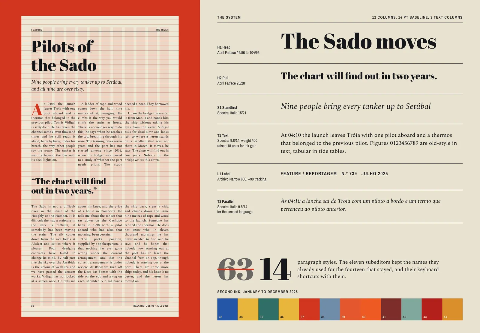
Seven typefaces became two. Abril Fatface does the shouting, at sizes where its hairlines are thick enough to print. Its heavy stems are almost immune to dot gain, and at spine width it still reads as a word.3 Spectral sets everything from the standfirst down. It was drawn for screens, which sounds like the wrong qualification, but its open counters hold on soft paper better than the Garamond the magazine had used since 1988. I raised the text weight by 18 units to allow for the ink that spreads and the ink that shows through from behind.
Text went from 8.6 on 10 points to 9.8 on 14, which costs about 11 percent of the words on a page. Most of them came back when I moved to three columns on a 12-column grid and dropped the boxed pull-outs, each of which repeated a sentence the reader was about to meet anyway.
The 63 paragraph styles in the old template became 14. The styles that stayed kept their names and their keyboard shortcuts, because the subeditors had those in their fingers and there was no week in which they could unlearn them. H1 was still H1 on the morning of the changeover. It simply looked different. We ran one afternoon of practice on copy from the November issue, and I have not had to change a style since.
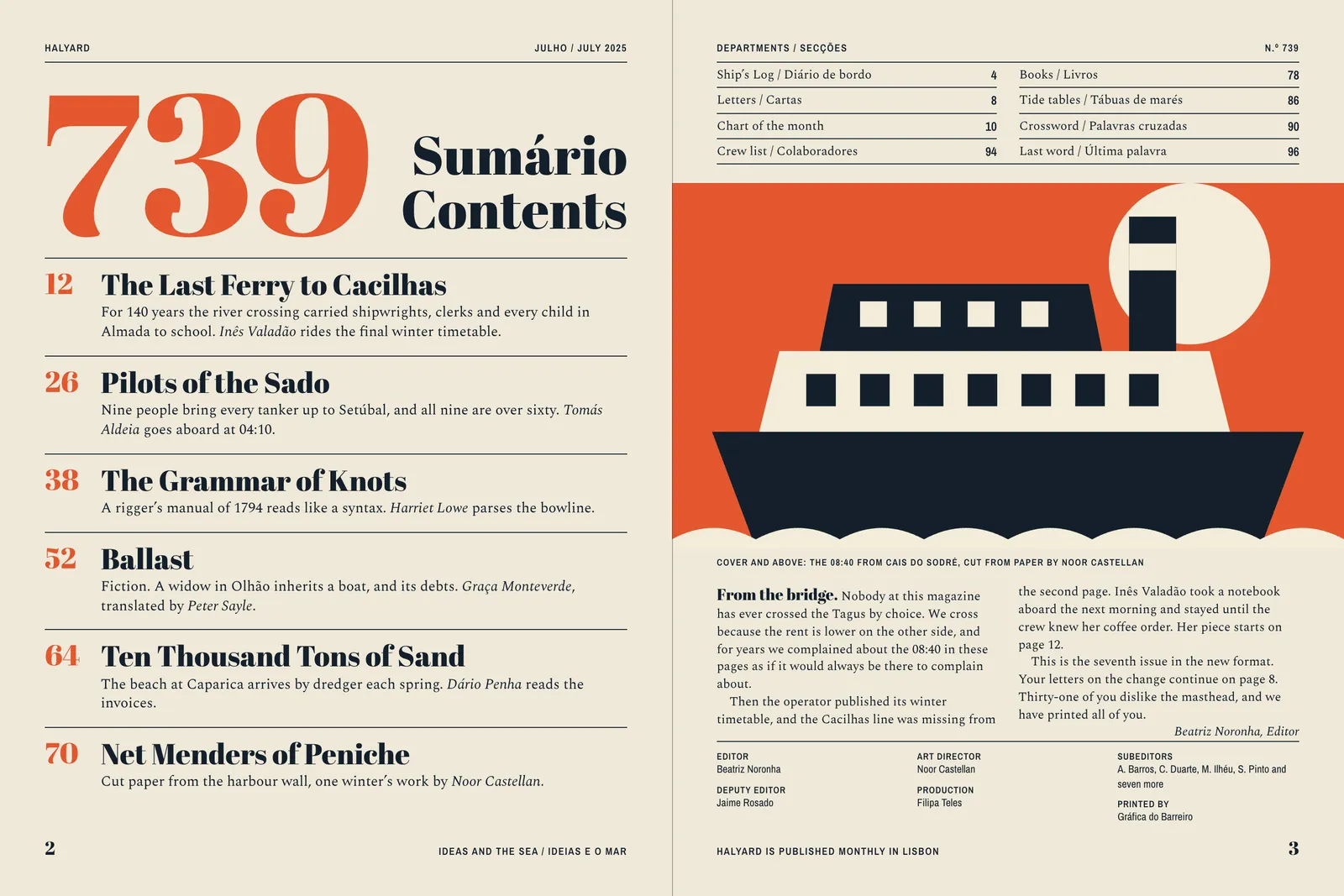
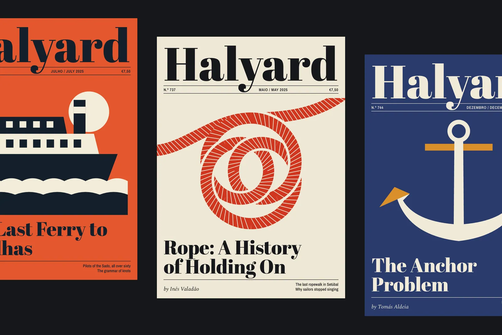
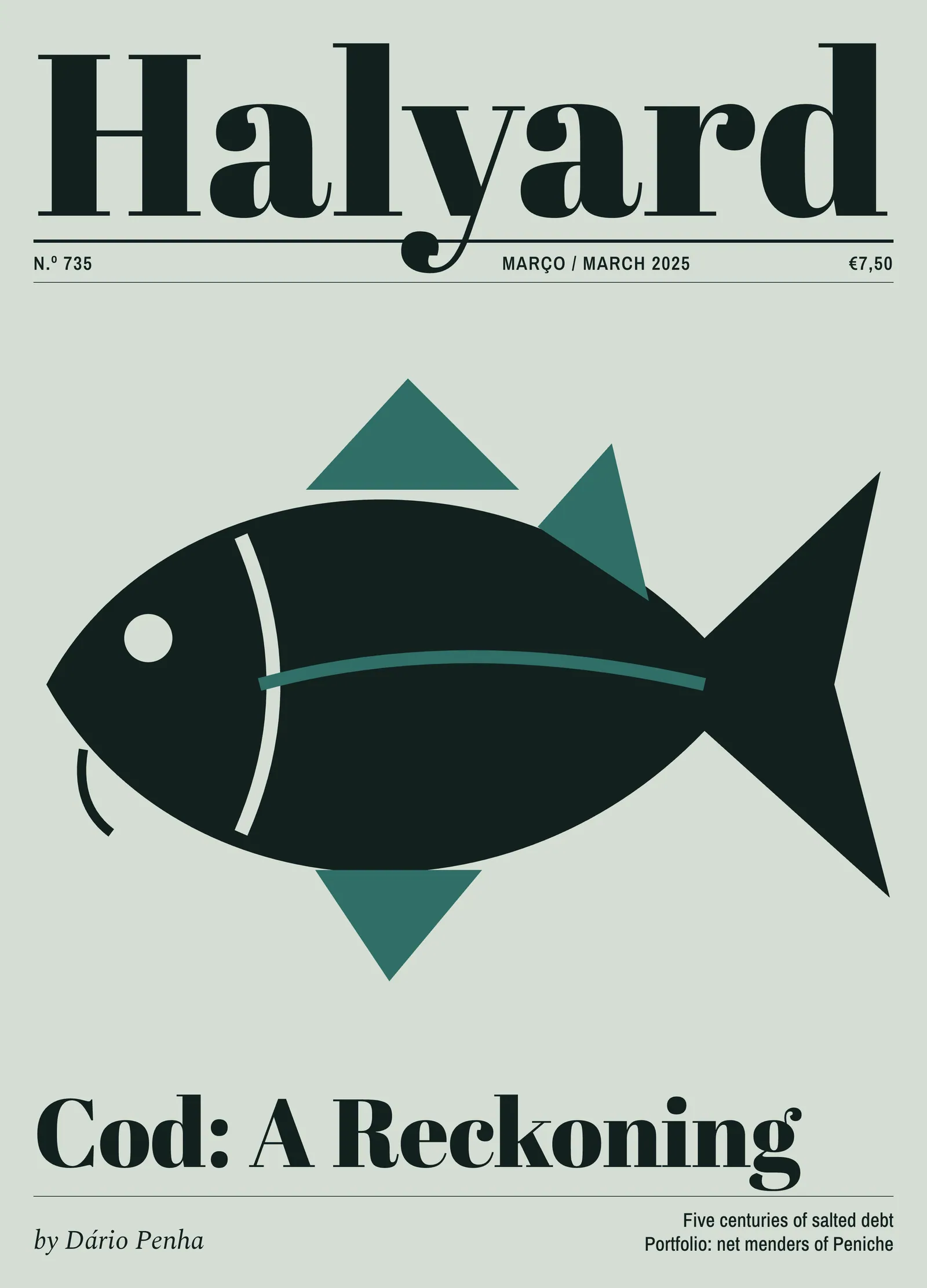
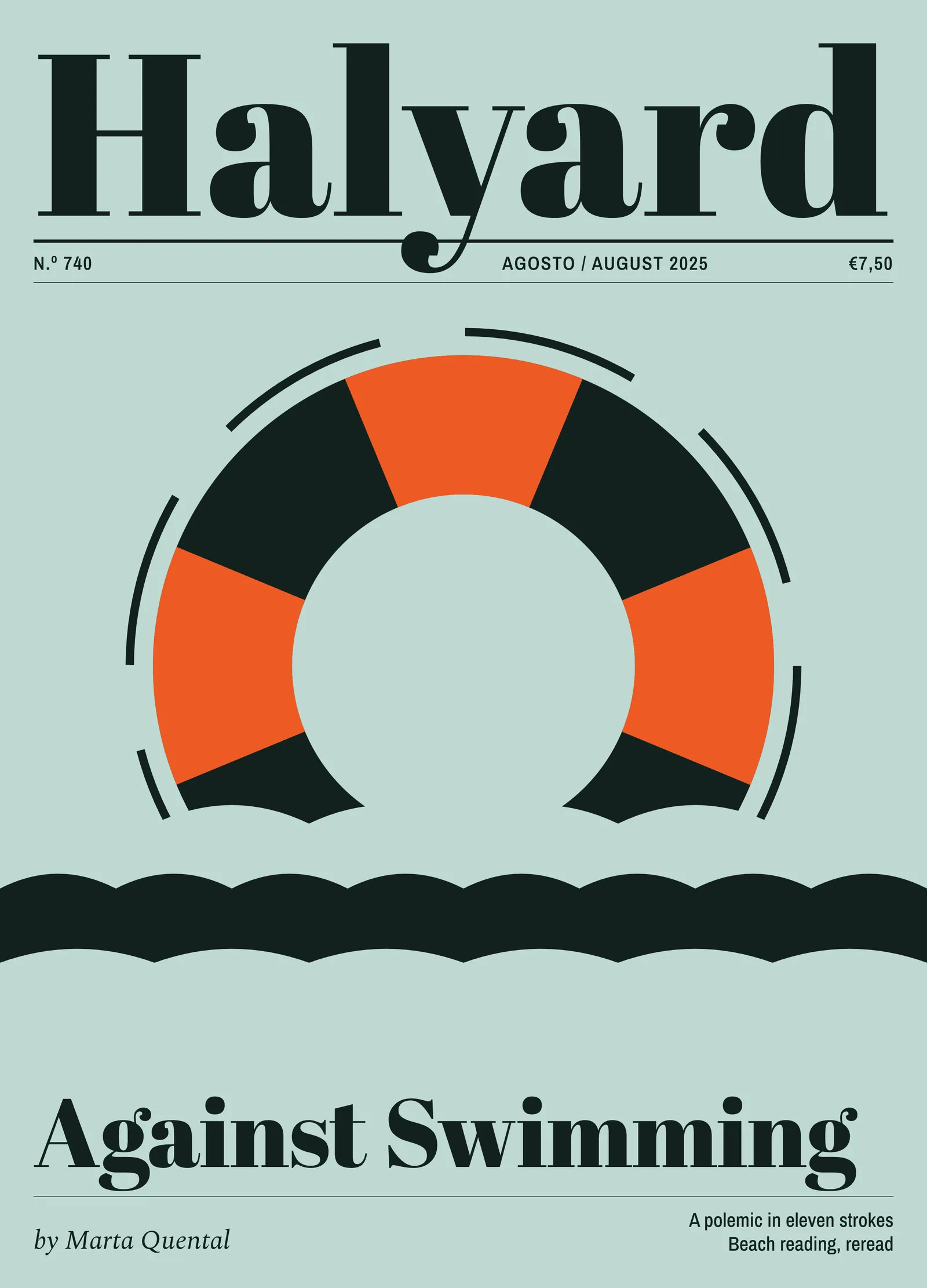
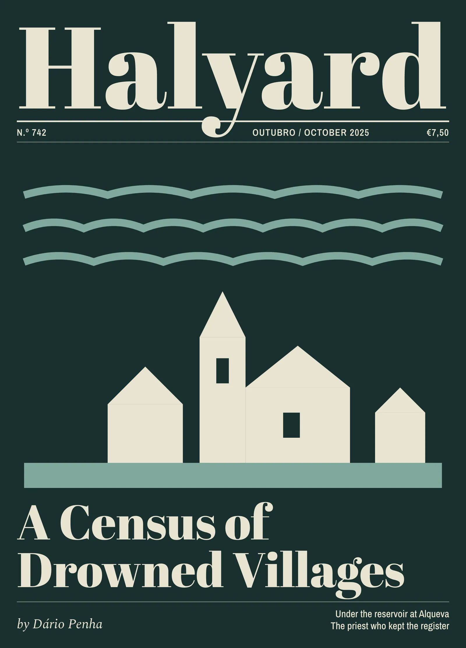
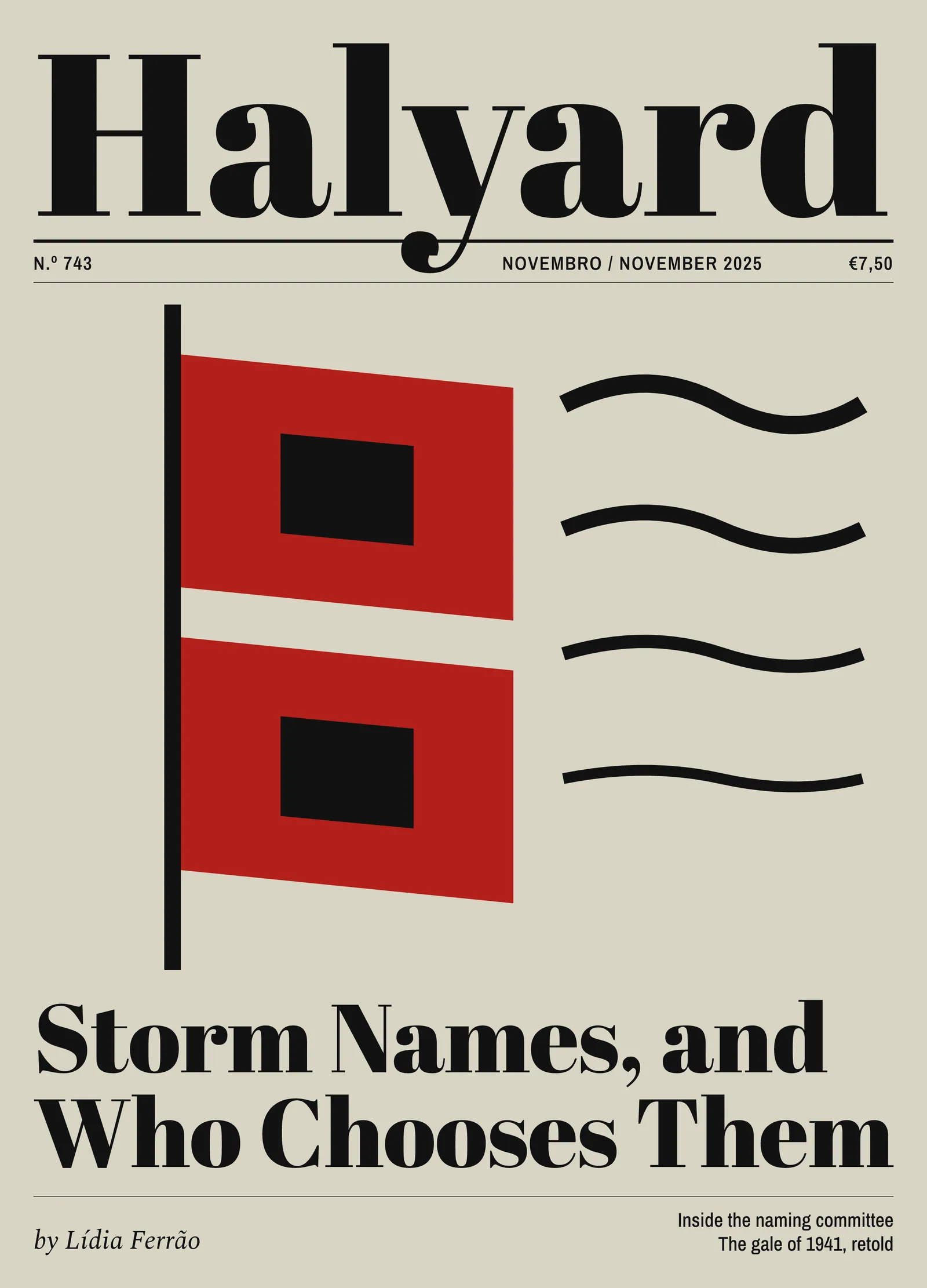
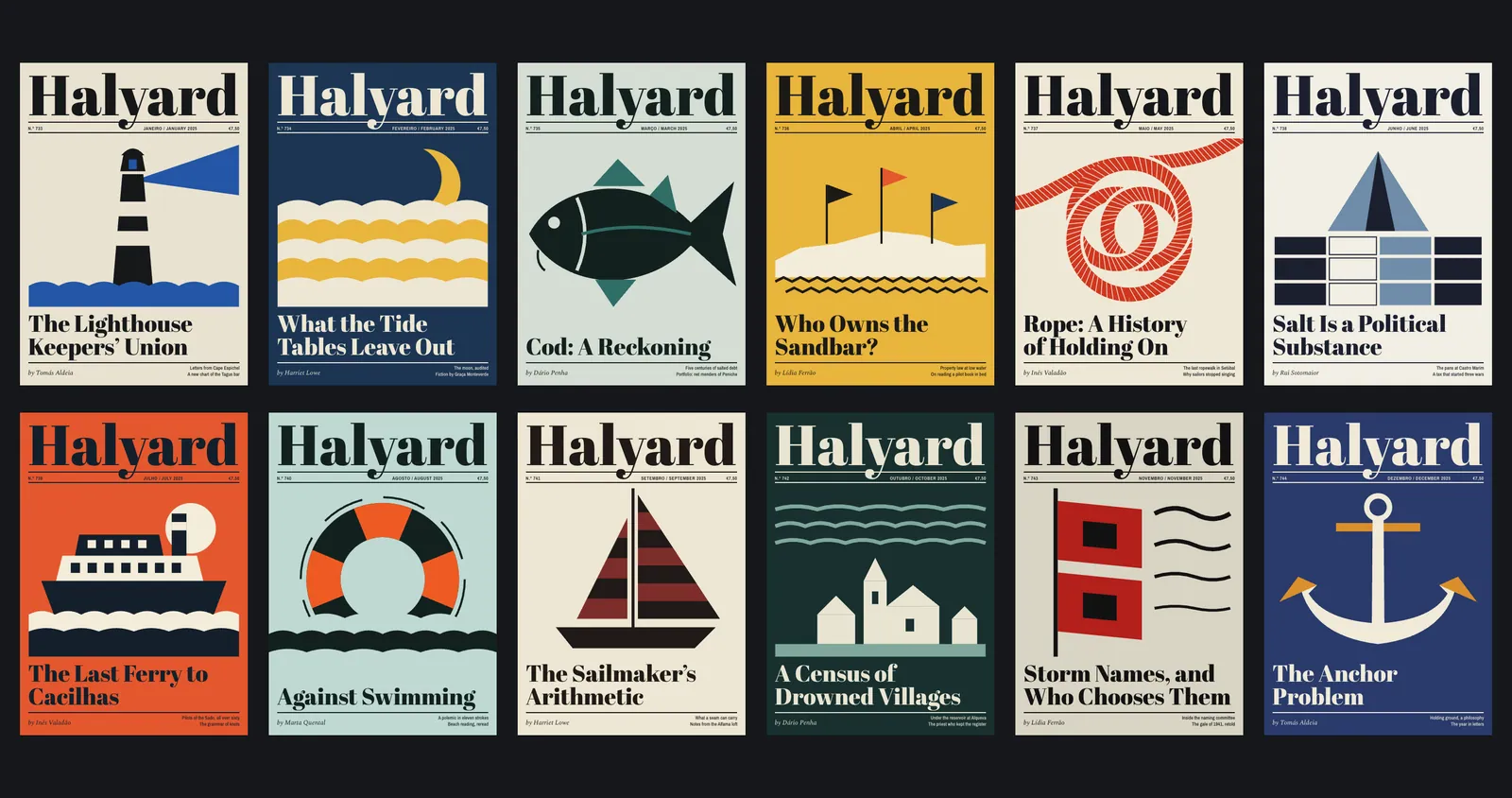
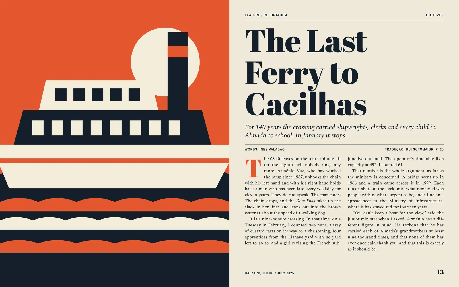
With no pictures to buy, the covers had to be made from what we had, which was scissors. Each month I cut one shape from coloured paper, related to the lead essay. It is scanned and separated into two inks, black and a spot chosen for that issue. A rope for the history of knots in May, a ferry in July, a pair of gale flags in November. Flat colour is the one thing this press does without complaint. There are no shadows to fill in and nothing to run at 60 lines per inch.
The masthead fills the full width of every cover in the same position, and the title of the essay sits below in the same face. There are two sell lines, always bottom right, always one size. A cover takes me about a day. Readers used to spot the magazine by its yellow, and now they spot it by the size of the word. Newsagents in Lisbon, who are the hardest critics we have, say they no longer need to look for it.
I came in on the Monday braced for a new way of working. It was the same keys. I made my first page before my coffee went cold.
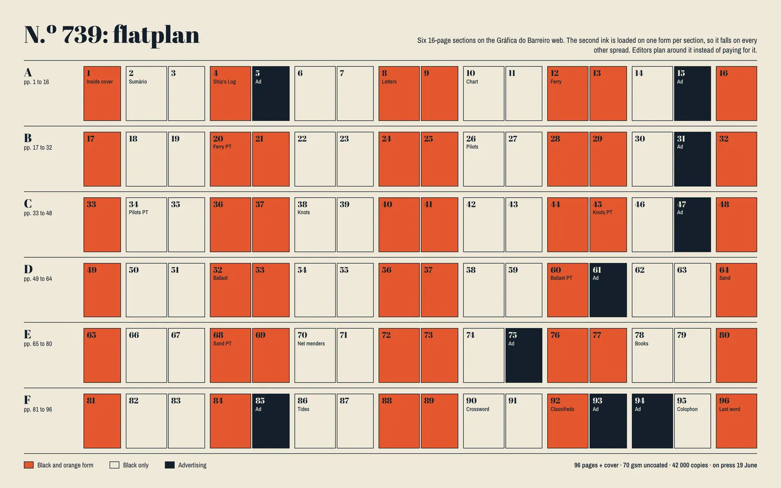
A second colour across all 96 pages would have cost more than the old covers did. So the spot ink is loaded on one form per 16-page section, which puts it on alternate spreads through the magazine. The flatplan has become an editorial tool: a feature is laid out knowing where the colour falls, with a drop cap and a headline in the spot ink where the form allows it and plain black where it does not. After two issues the editors stopped mentioning it, and no reader has noticed the pattern.
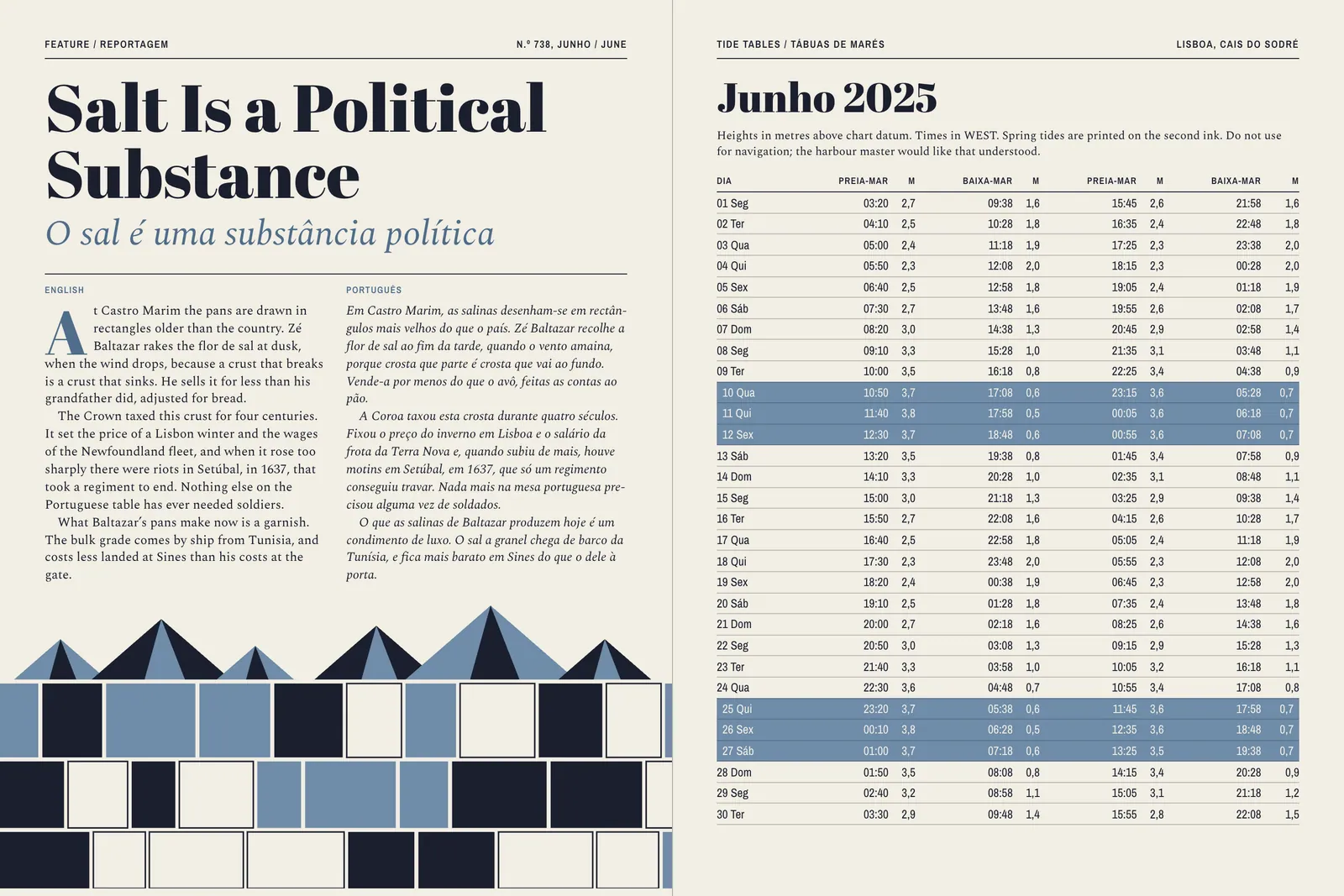
Portuguese was the last problem. Halyard has always printed both languages, and it used to bury the translation at the back in 7 points, which told half its readers what the magazine thought of them.4 Shorter pieces now run in parallel columns, with the original in roman and the translation in italic, whichever language came first. Longer features run the translation straight after the original at full size. The tide tables, which readers would defend with their lives, kept every column.
The first new issue, No. 733, went on sale in the third week of December 2024, on the same day of the month as every issue before it. Across the twelve issues that followed, newsstand sales rose 18 percent and renewals climbed from 71 to 83 percent. The print bill fell 6 percent, because the second ink runs on a fraction of the forms and the covers no longer need four plates. Readers under forty went from 9 to 16 percent of subscribers.
The subeditors missed one deadline in the first month, by ninety minutes, and have not missed one since. Thirty-one readers wrote in to object to the masthead, and the editor printed all of them. One, in Olhão, said the magazine had been going downhill since 1971. He has renewed.
Ends, page 21
Continued on page 22