Continued on page 40
Five Centuries of Blue, Held to a Single Ink
No. 4,620, Sunday 8 November 2026
Feature, page 22. Book jacket series
A three-person press in Setúbal needed its translated fiction to be seen across a bookshop, at about half the old cost of a jacket.
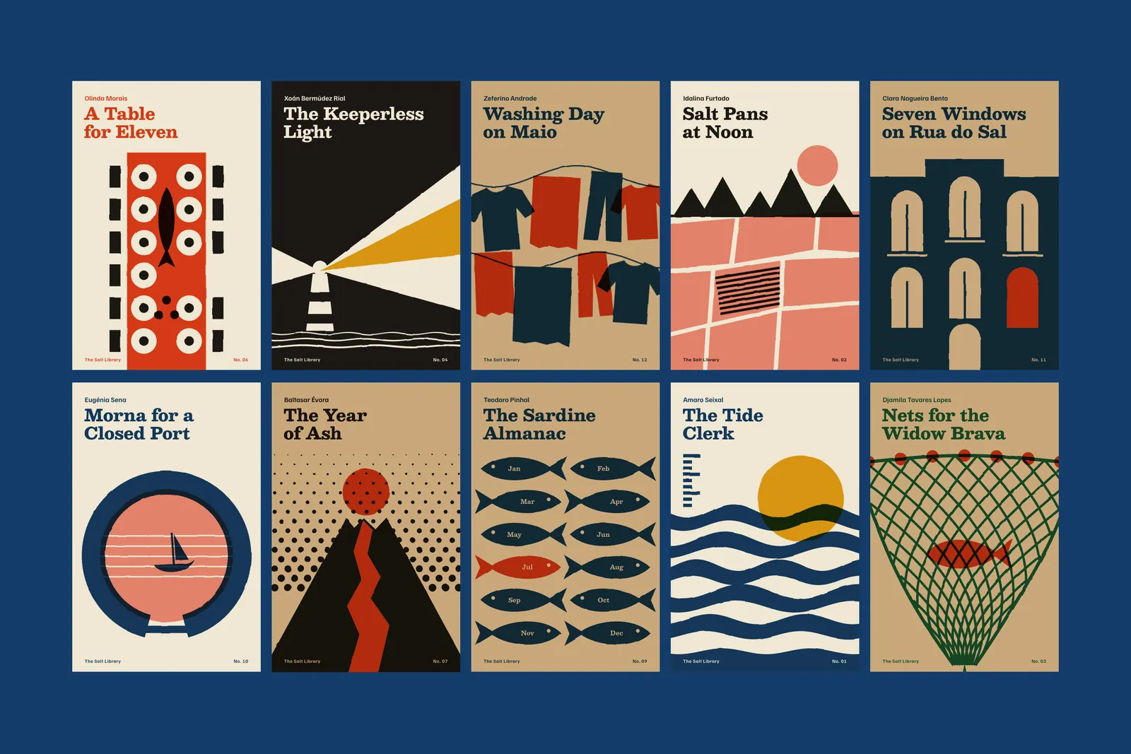
Ostra Press is three people above a ship chandler in Setúbal. In the autumn of 2022 Inês Albergaria, who owns it, asked me to design the jackets for a series she had spent six years assembling: twelve mid-century novels, translated into English for the first time from Portuguese, Cape Verdean Creole, and Galician.1 None of the authors is known outside a few university departments. Several are not known inside them.
The brief arrived on a postcard, which I still have. The books had to be seen from across a shop. They had to read as one library. And they could not cost more than the €0.38 per jacket left over after translators and paper. Ostra’s usual four-colour laminated jacket came in at €0.71, on runs of 3,000 that took four years to sell. These would run to 1,800 a title.
I spent the first fortnight with the estimator at Gráfica Sado rather than at a desk. At 1,800 copies, the largest variable cost on a jacket is the press wash-up between inks, followed by the die, followed by anything that goes on after printing. A third colour moved the quote to €0.46. Lamination took it to €0.52. A photograph needed a licence, and for most of these books no suitable picture existed anyway: there is no archive of the salt workers of Aldeia da Marinha, because no one thought to make one.
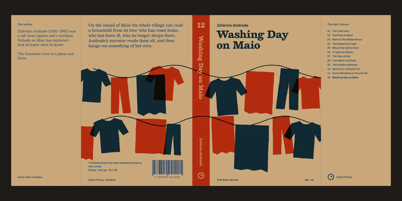
So the rules wrote themselves. Two spot inks on an uncoated stock. No finish of any kind. No licensed images. And one die for all twelve books, which was the hard one, because the novels run from 168 pages to 416. A jacket die is usually made to suit a spine.2
The answer came from Filipa Neto, Ostra’s production manager, who pointed out that nobody measures a flap. We fixed the flat jacket at 440 mm. As the spine grows from 17 mm to 31 mm, the flaps shrink from 82.5 mm to 75.5 mm, and the same die cuts every title. That one conversation saved €1,760 across the series.
I told Noor I could not afford a designer who wanted a third colour. Noor said that was a relief, because nobody wanted one.
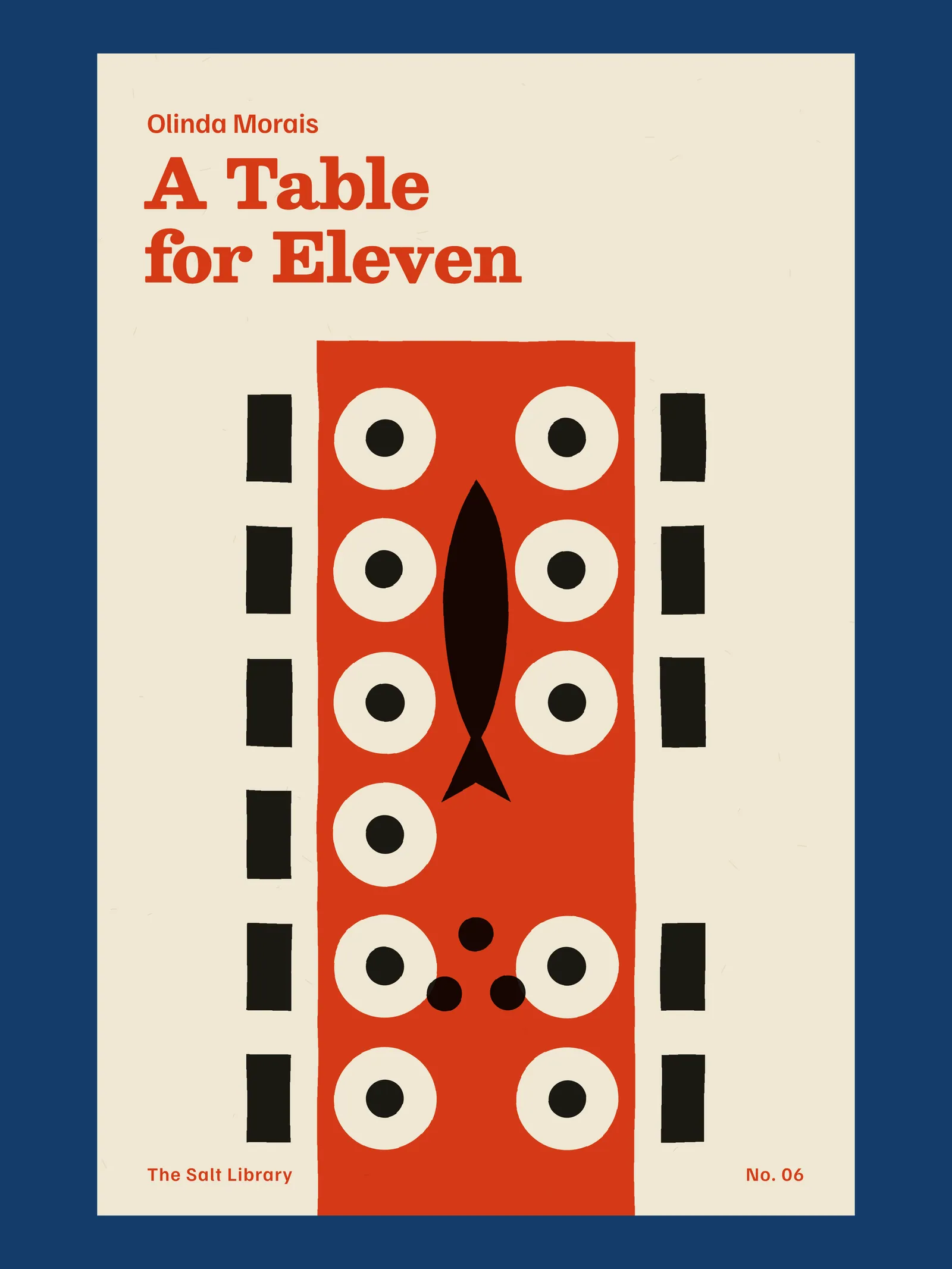
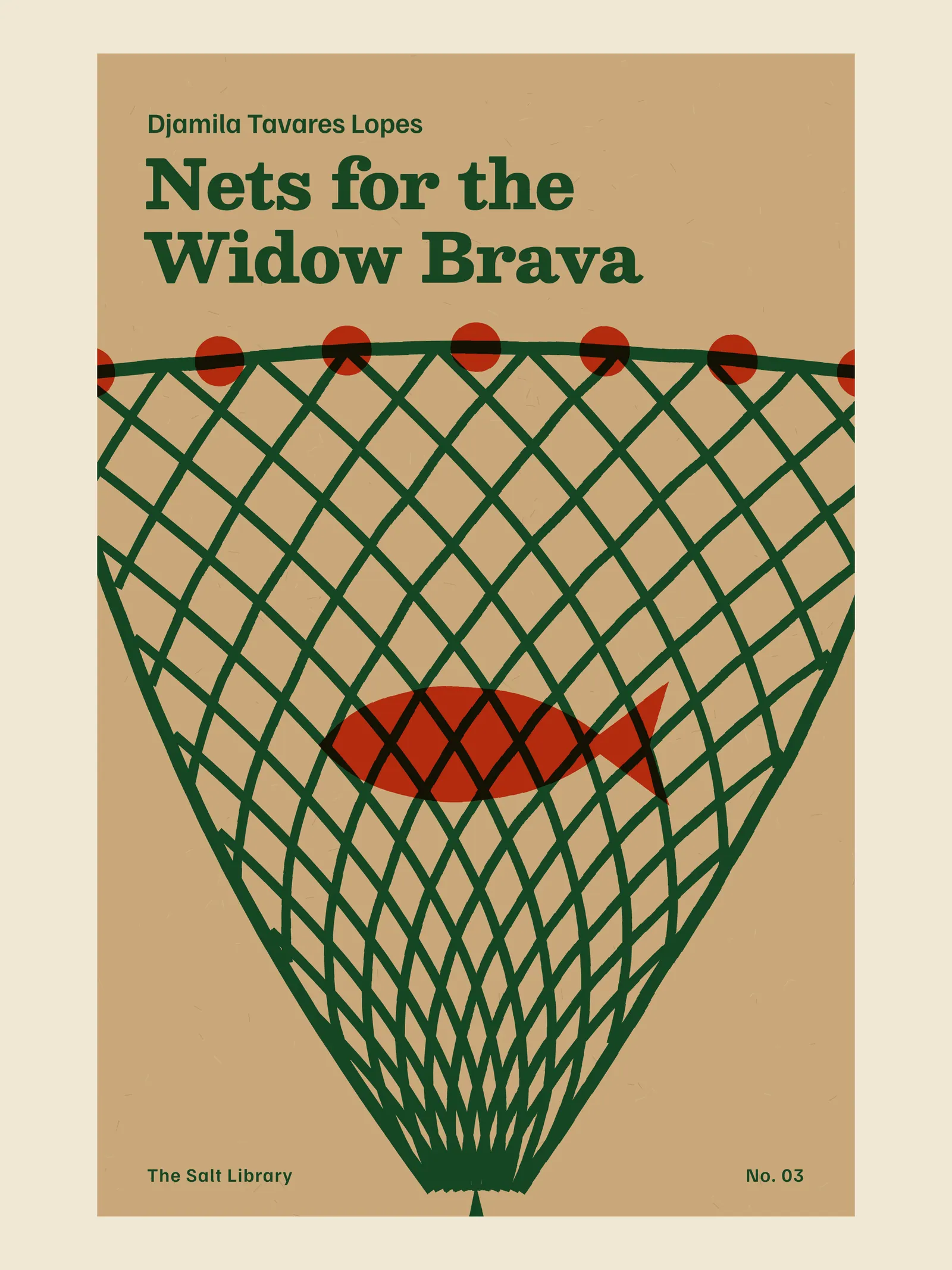
With no pictures to buy, the jackets had to be made. I read all twelve manuscripts in the first draft of their translations and wrote one object on an index card for each: a tide gauge, a raked heap of salt, a net gathered to a point. Then I cut each one from coloured paper with a scalpel, at jacket size, on a kitchen table in Graça.3
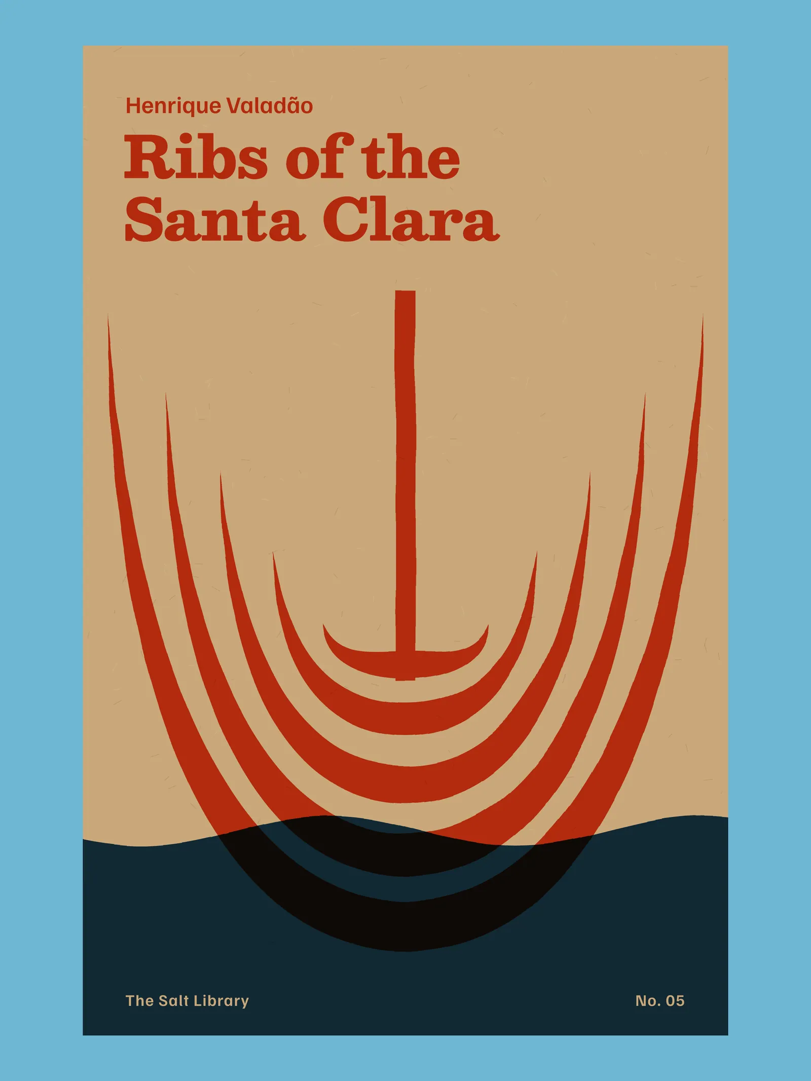
Cutting kept me honest. A scalpel cannot render a mood, so the compositions had to rest on a single large decision. Morna for a Closed Port is a ring with a bar across its mouth and a boat sitting on five stave lines like a note. Ribs of the Santa Clara is five frames of a schooner seen from the stem, sinking into a band of blue. The Sardine Almanac has twelve fish, one for each month and chapter, and the July fish is red because that is the month the foreman dies.
Once a composition held up, I scanned it and redrew it as two separations, keeping the wobble of the blade on every edge. A clean vector line on kraft looks like a mistake. A cut one looks like someone meant it.
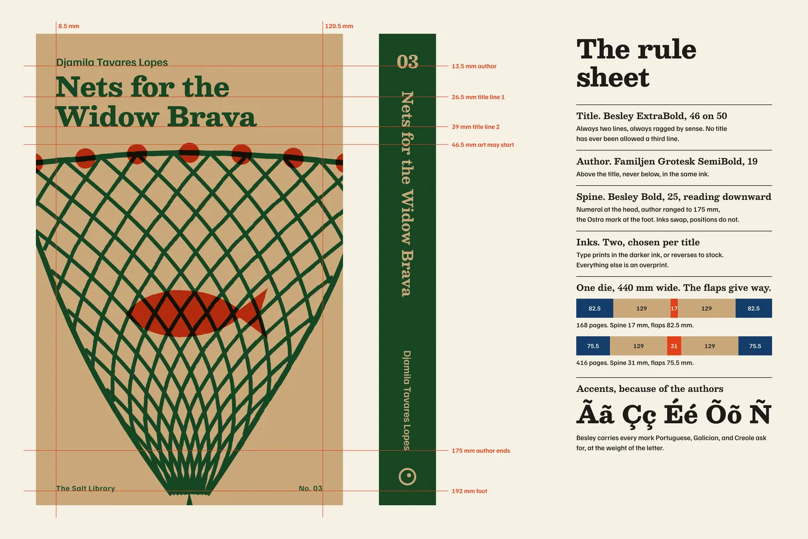
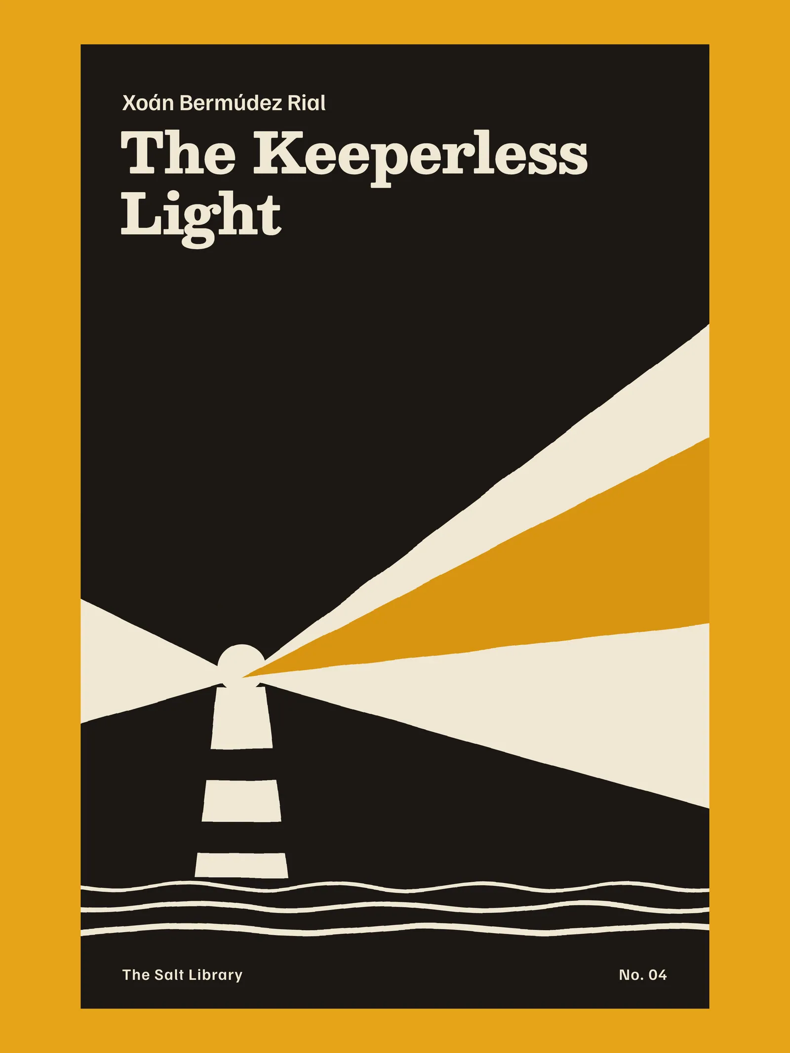
If the pictures were going to vary this much, the type could not vary at all. Every title is Besley ExtraBold, 46 on 50, in exactly two lines, with the author above it in Familjen Grotesk. I chose Besley for its slab-footed Clarendon manners, which belong to the period and to the Portuguese printing I grew up looking at, and because it holds its accents at full weight. Xoán and Évora should not look like an afterthought.
Two lines was a real constraint on the editors. Seven Windows on Rua do Sal fits with four units to spare. Tomás Reboredo, the series editor, retitled one novel rather than let it run to three, and the author’s estate agreed by return of post.
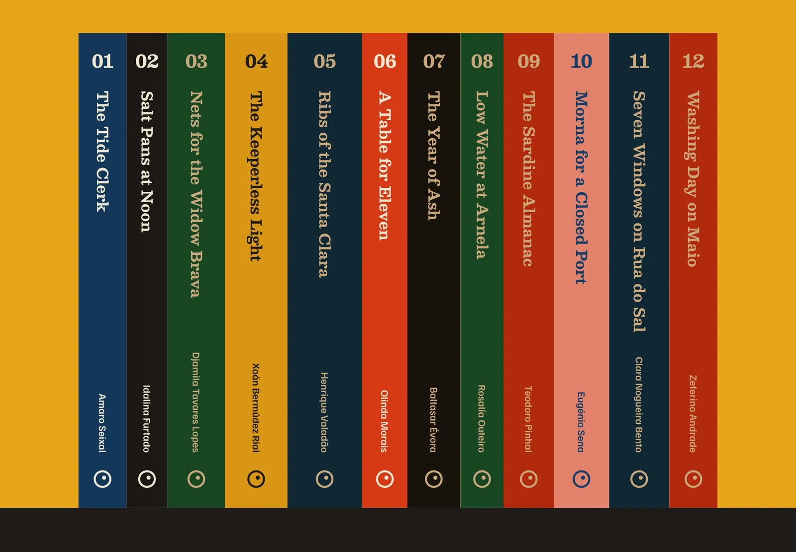
The spine is stricter still. Numeral at the head, title reading downward from a fixed point, author ranged to 175 mm, the Ostra mark at the foot. Inks swap from book to book. Positions never do. Stood together, the spines make a colour chart with a very consistent caption.
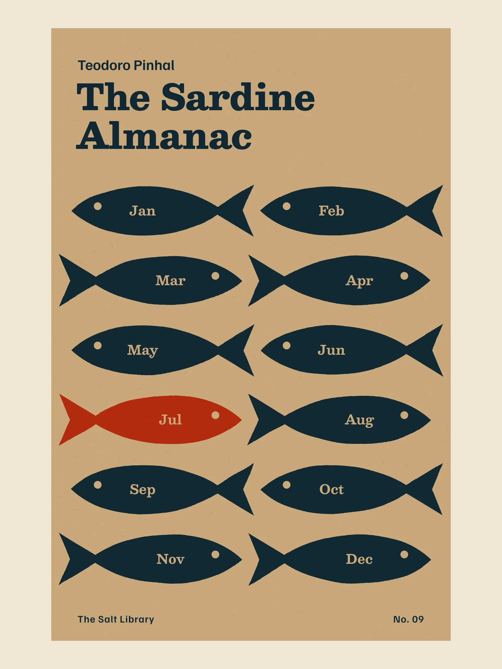
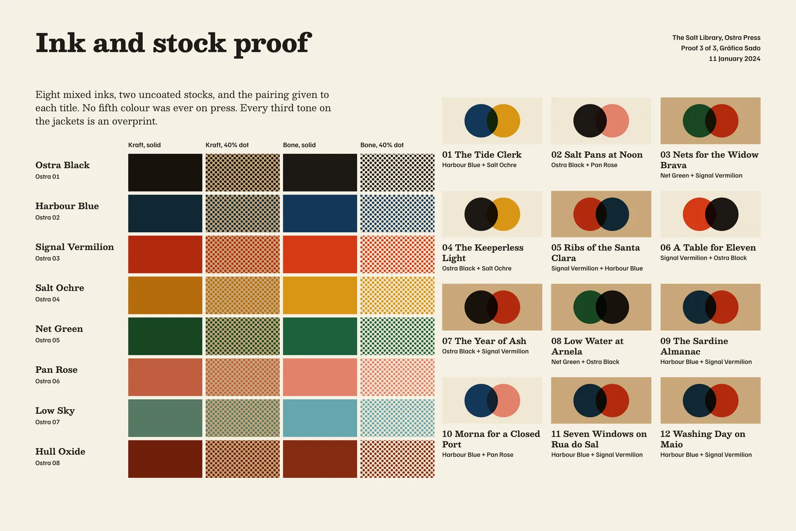
Uncoated kraft eats ink. Signal Vermilion on bone is a shout; on kraft it goes down to the colour of a rusted hull, which I liked for the shipyard book and hated for the kitchen one. So every pairing was proofed on both stocks, three rounds in all, and A Table for Eleven moved to bone in the second round.
We mixed eight inks at Sado and gave each title two. Where they cross, they multiply, and that overprint is the third colour we were not paying for. Ribs turn black under the waterline. A sun goes dark behind a wave. I stopped thinking of it as a limitation about halfway through, when I noticed I had started designing for the overlap first.
Noor stood at the delivery end for two days with a loupe, and on the second day asked me to put less ink on, which no designer has asked me in forty-one years.
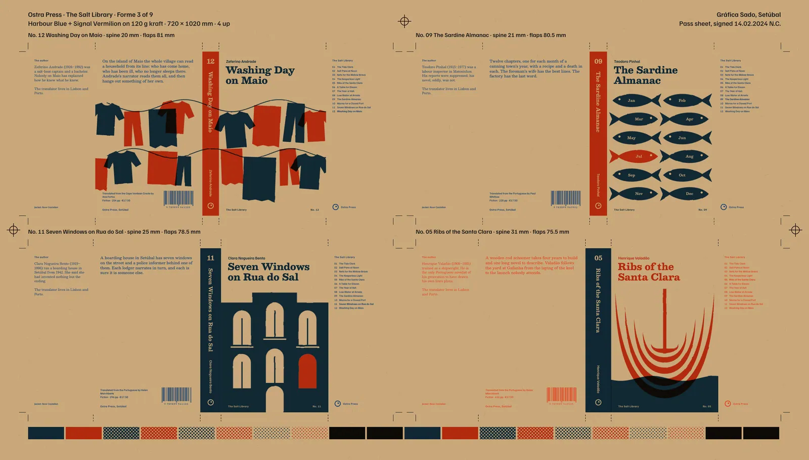
The press run took nine formes, because four titles could share a pair of inks and the other eight could not. Gráfica Sado delivered in March 2024 at €0.34 a jacket, four cents under the postcard.
Ostra sent the first six to sixty-four independent shops with a request that they be stood face out, and most of them were, since a kraft book with a red table on it is an easy thing to put in a window. Average first-year sales came to 1,540 copies a title, where Ostra’s translated fiction had averaged 610. Seven of the twelve went back to press within sixteen months.4 The authors’ estates, some of whom had to be found first, have had royalty statements for the first time since the 1960s.
I keep the spines on the shelf above my desk. They are the only thing in the studio I have not wanted to redesign.
Ends, page 39
Continued on page 40