Continued on page 56
Sunday Section Stops Apologising for Newsprint
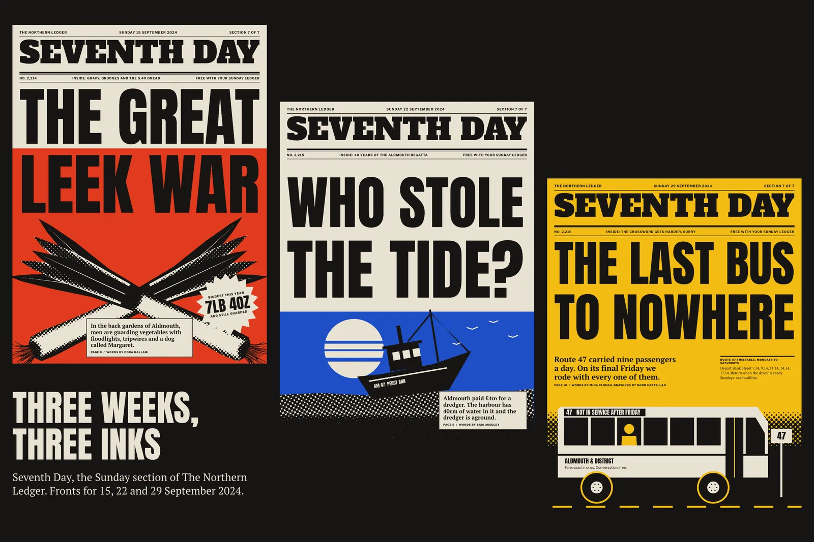
No. 4,620, Sunday 8 November 2026
Feature, page 40. Museum catalogue
A 416-page catalogue of painted tiles for the Museu da Ribeira, where one custom cobalt had to pass for every workshop from 1510 to 1998.
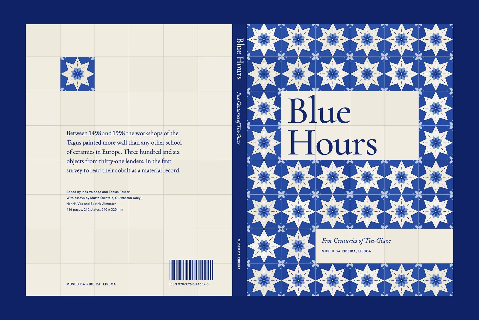
The Museu da Ribeira holds the largest public collection of painted tile on the Tagus, and in 2023 it decided to show all of it at once, or as near as the walls allowed. Blue Hours opened in September 2026 with 306 objects from thirty-one lenders. Inês Valadão, who curated it, asked me for a catalogue that would still be useful when the show had gone back into its crates.
Useful had a precise meaning for her. Her conservators keep a shelf of tile catalogues and do not trust any of them for colour.1 A book that reproduced the blue accurately would be consulted for decades. A book that reproduced it the way most books do would be admired for a season and then shelved with the others.
So the brief was one sentence on a sheet of museum letterhead: the reader should be able to hold plate 63 against tile 63. The rest of the job followed from that sentence, including the parts that nearly sank it.
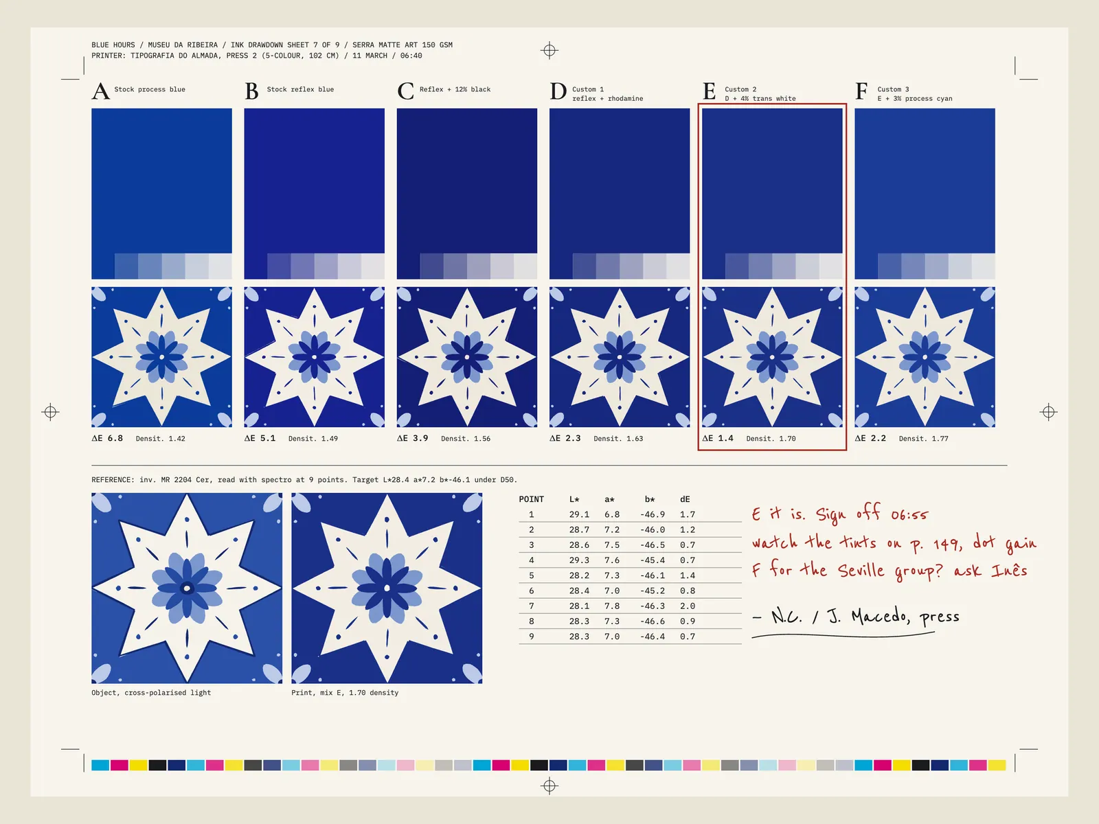
Cobalt on tin glaze sits outside what cyan and magenta can reach. On a gloss sheet the miss is tolerable. On a matte sheet, which we needed so that the text pages and plates would feel like one book, the blue dulls and drifts toward violet.2 We were printing on Serra Matte Art at 150 gsm because the museum had a paper grant, and that decision could not be reopened.
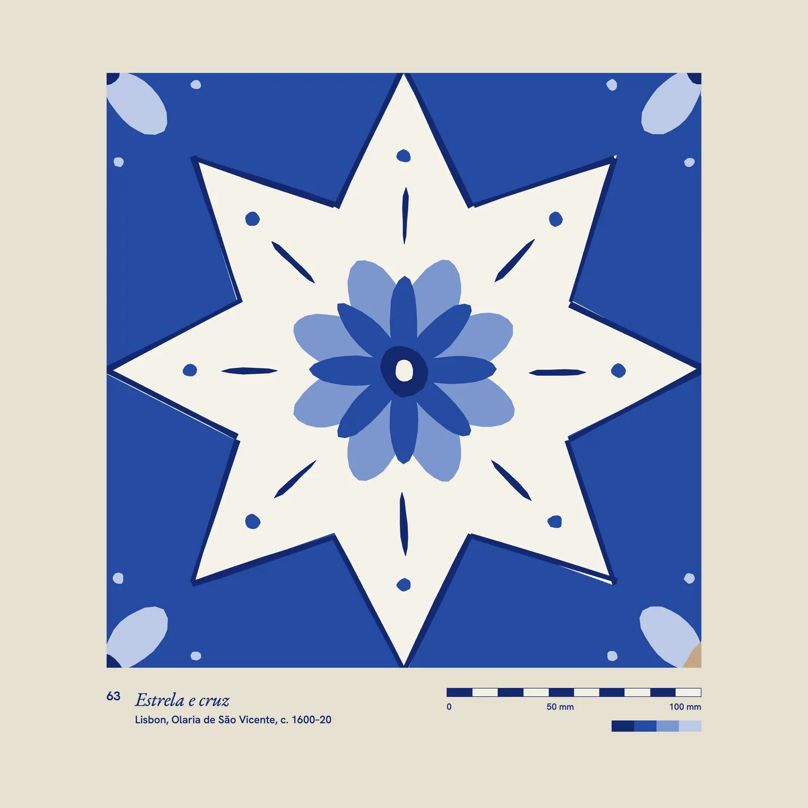
The press was a five-colour, so four process units and one free. I took a single reference, inventory MR 2204, a star-and-cross tile from about 1610, and asked João Macedo at Tipografia do Almada to mix against it. We drew down six candidates on 11 March. Stock reflex blue read as ballpoint. Reflex with black was close and printed heavy. Mix E, a reflex warmed with rhodamine and let down with 4% transparent white, came in at ΔE 1.4 against the object at 1.70 density.
Every plate then went through a separate cobalt channel, built by hand by Bruno Saraiva from the raw captures. Five centuries of workshop blues were to be rendered by one ink and its tints, with process colour supplying only the antimony yellows, the manganese browns, and the shift in temperature between a Seville tile and a Porto one.3 The alternative was a second spot for the earlier work, and the budget allowed for one.
The schedule was the other wall. Text was due on 14 March and files on 30 May, which is eleven weeks for 416 pages, and five lenders had not yet confirmed. We would be imposing a book whose plates could still change.
I took plate 63 down to the store with a lamp and the tile. I have never been able to do that with a book before, and I keep doing it.
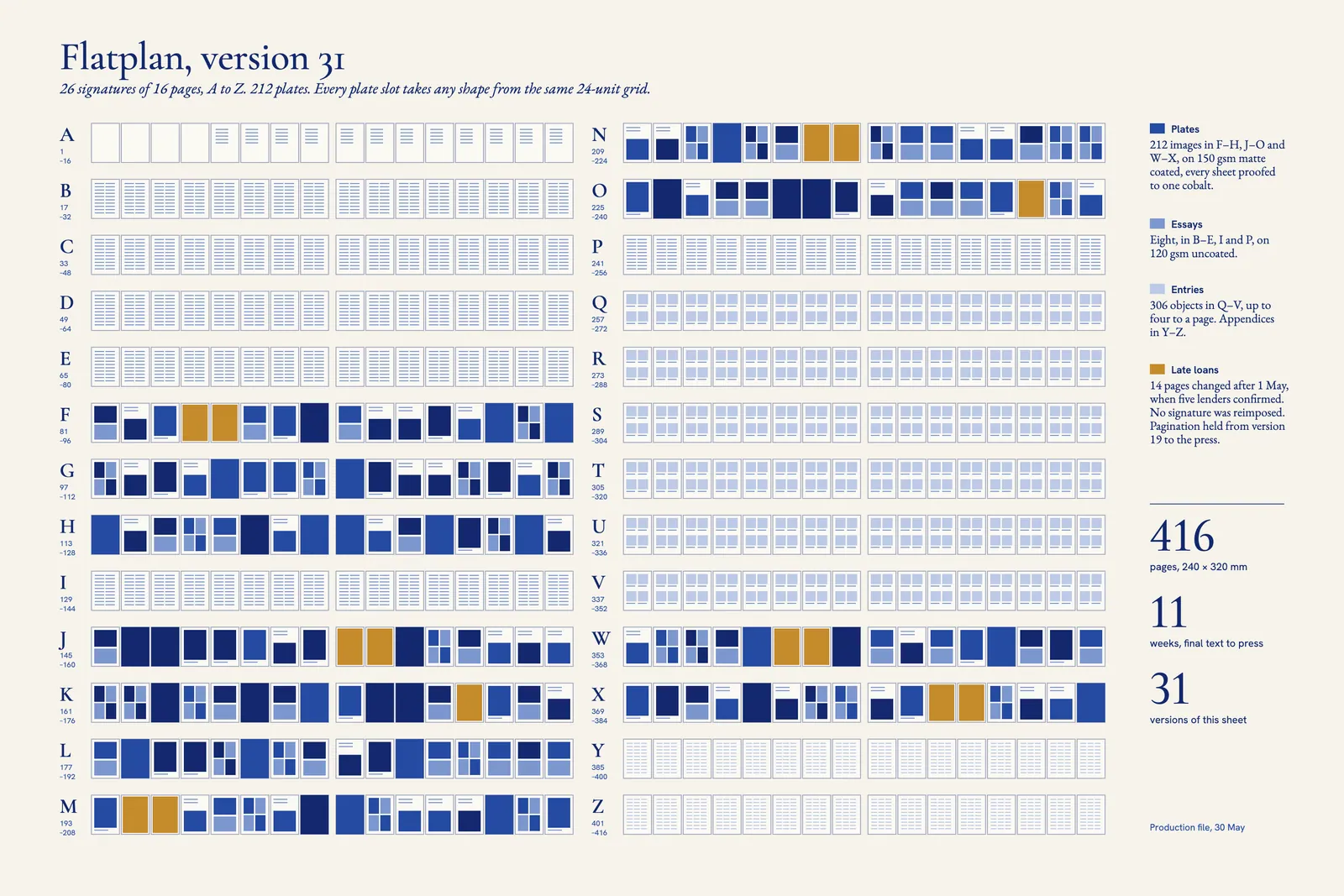
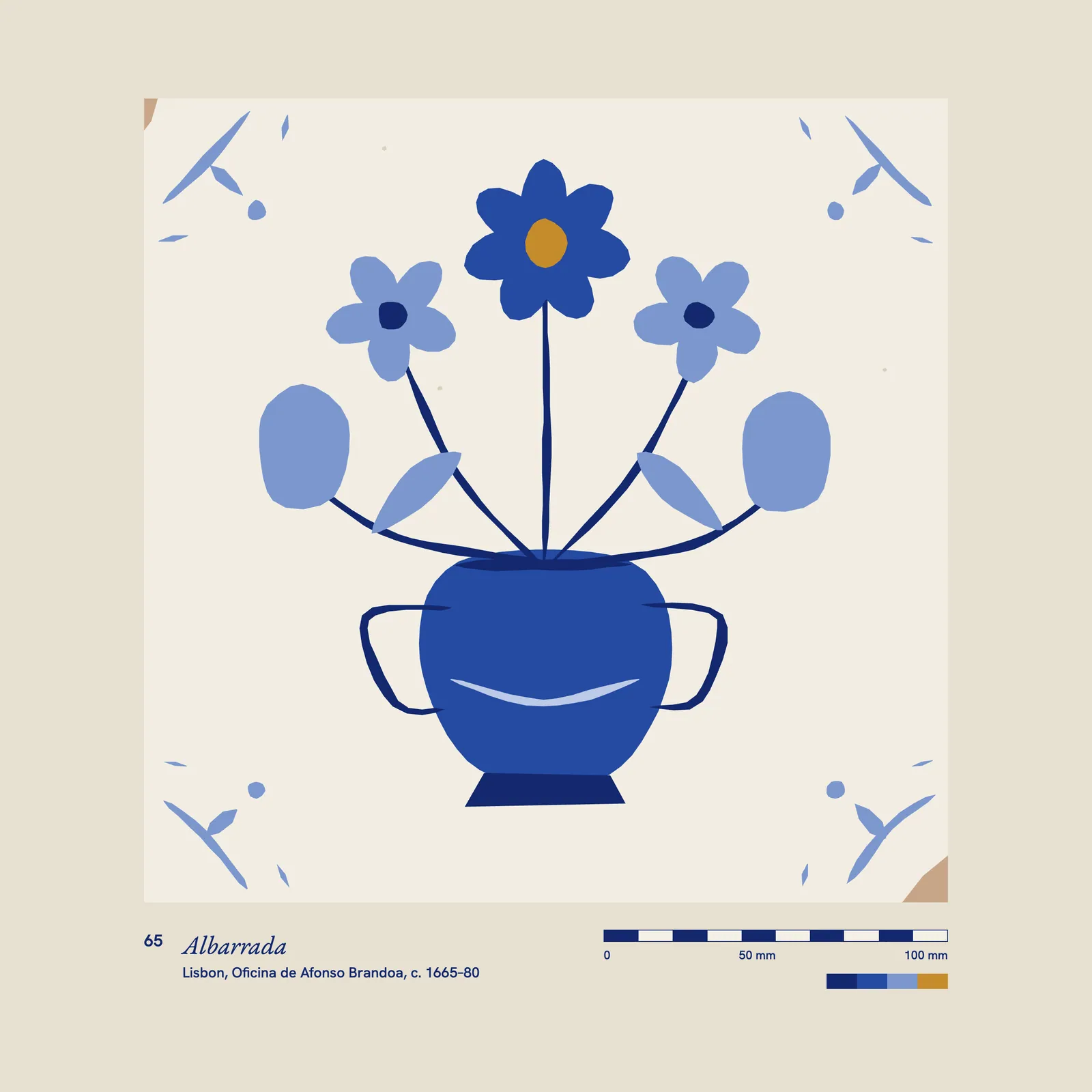
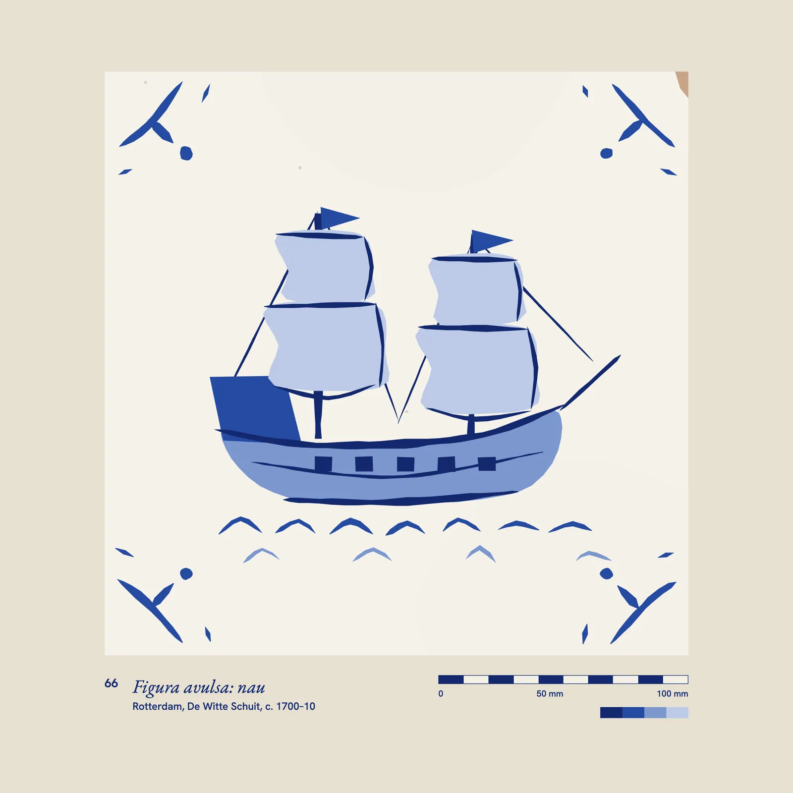
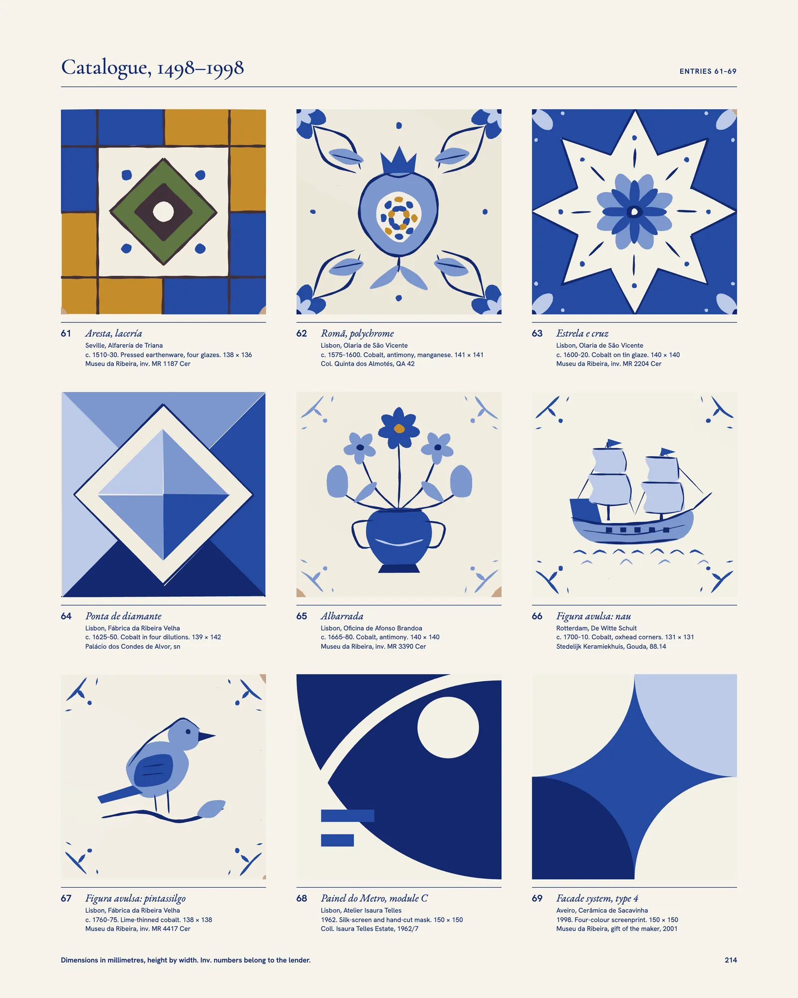
A catalogue normally fixes its plates and pours text around them. We could not do that, so the structure was built to absorb change at the level of the page and never above it. The book is 26 signatures of 16 pages, A to Z, which made the flatplan a sheet you could read on a wall.4 Plates share one 24-unit grid with a shared baseline for captions, and any plate slot accepts any shape: full page, half, a pair, or a block of four. A portrait panel replaced by a landscape one takes the same slot with no change to the page before or after it.
Captions were data, kept in a spreadsheet Tobias Reuter’s team edited directly and linked to the layout by catalogue number. When a lender in Évora withdrew a panel on 6 May and a private collector offered a better one nine days later, the replacement took one afternoon and touched two pages.
The last confirmation came on 22 May. Between 1 May and press, 14 pages changed. No signature was reimposed, and pagination held from version 19 of the flatplan to version 31, so the index we had compiled in April remained correct.
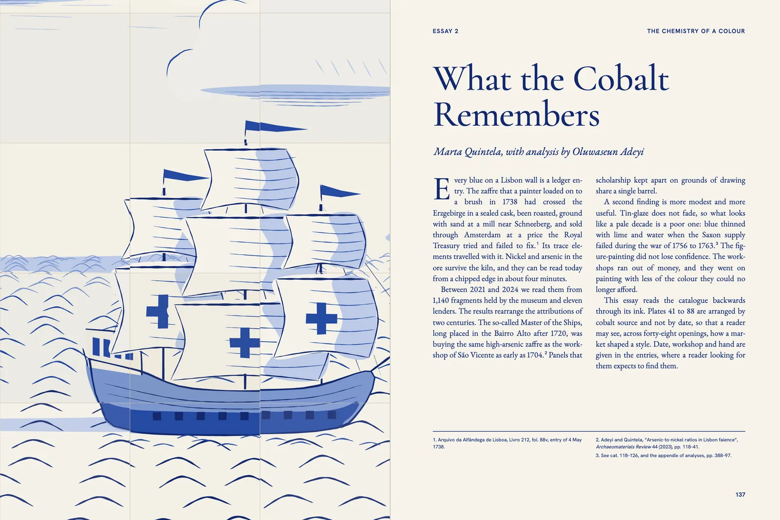
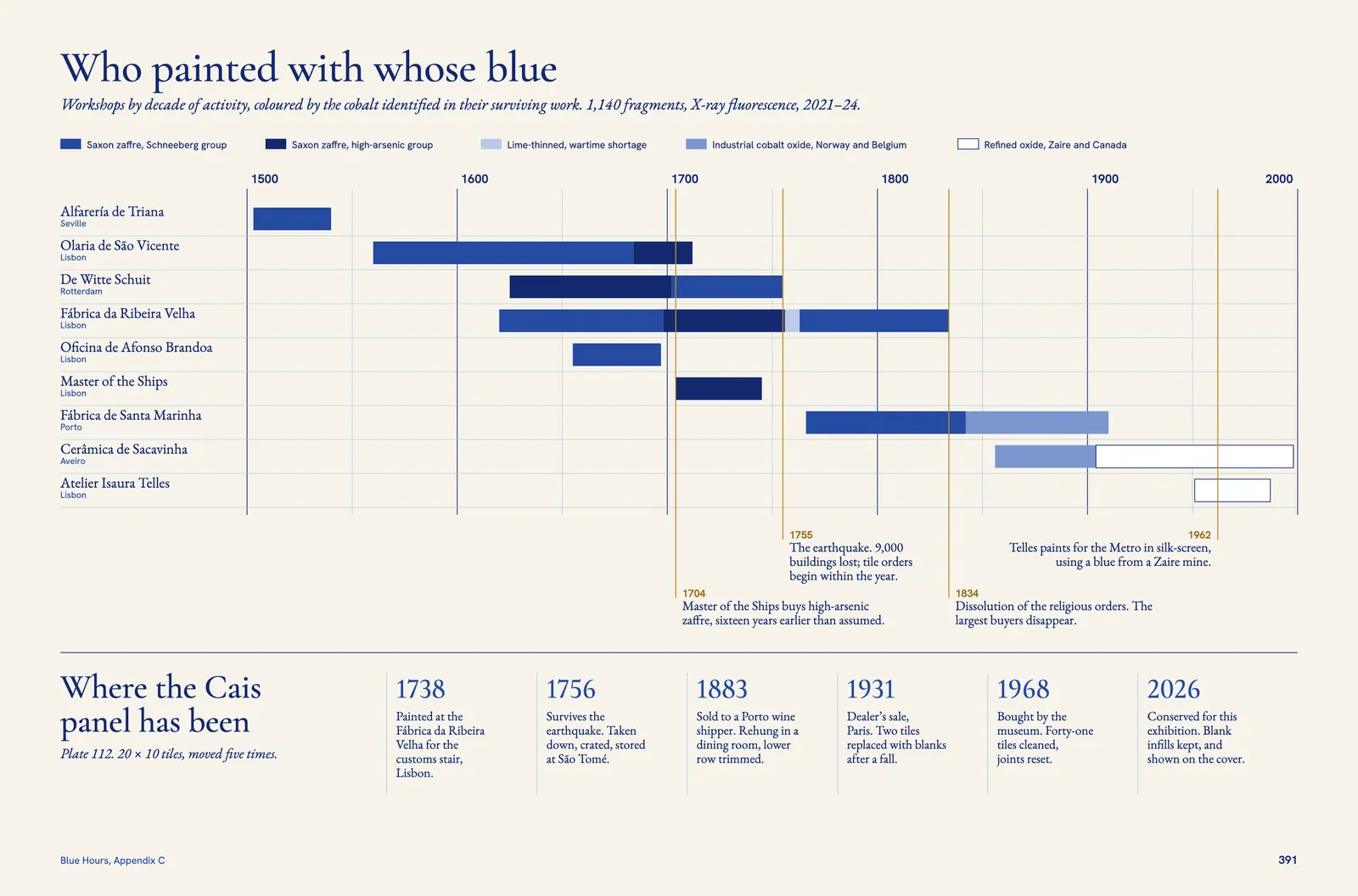
Marta Quintela’s essay on the chemistry of cobalt changed the order of the book. Her analysis of 1,140 fragments, with Oluwaseun Adeyi, showed that attributions made by drawing and attributions made by trace elements often disagreed. We gave that finding a structure. Plates 41 to 88 run by cobalt source and not by date, across forty-eight openings, and Appendix C charts every workshop against the ore it bought, so a reader can see a shortage arrive in the paint.
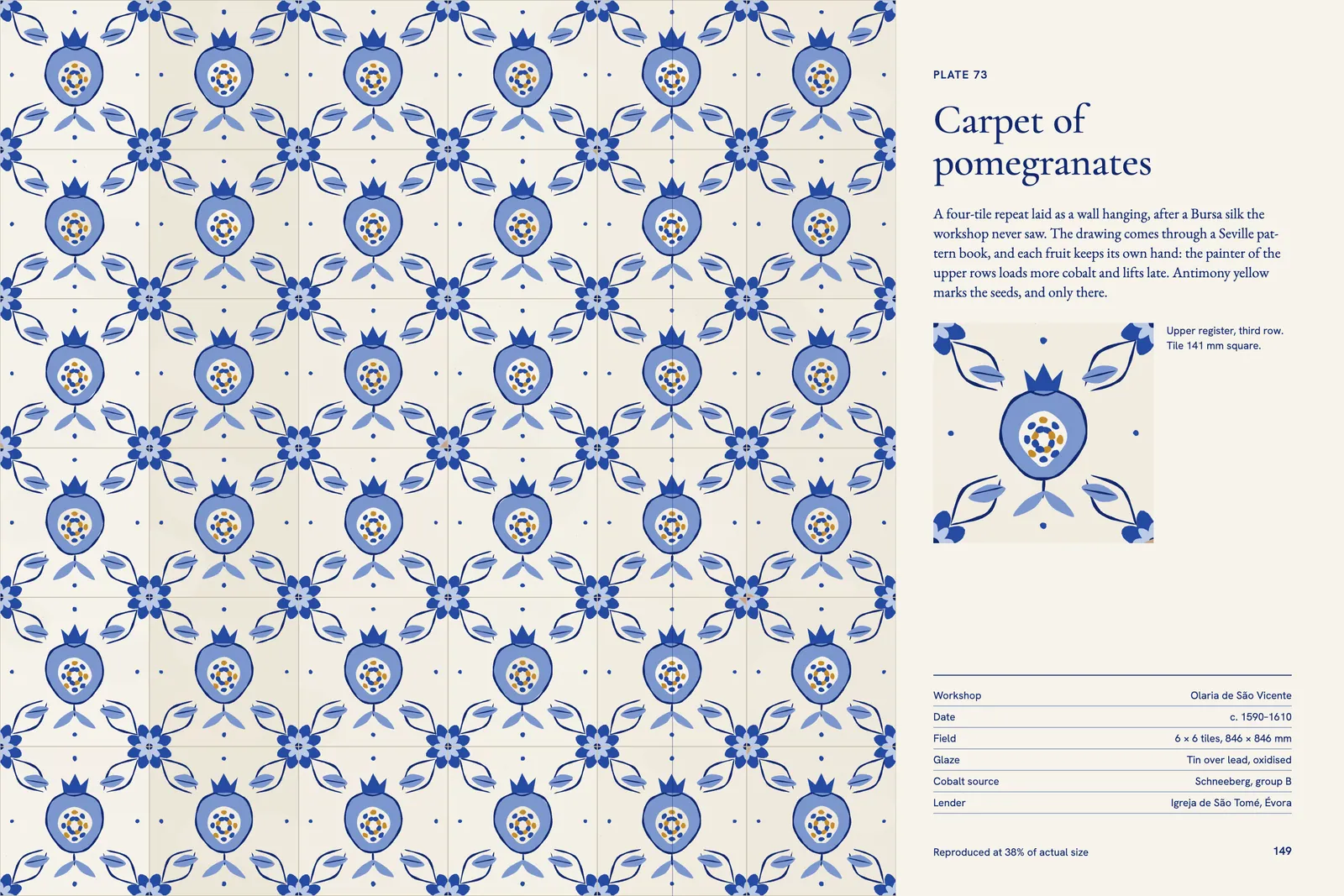
The entries went the other way, into rigid order. Tile data is dull and exact, so it gets a dull and exact format: number, title, workshop, date, materials, millimetres, inventory. Four to a page, 306 objects, no decoration.
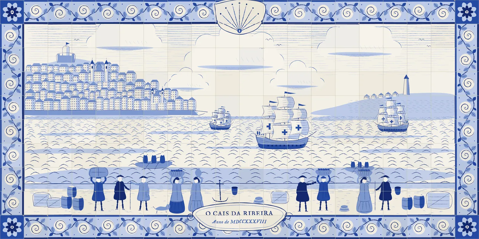
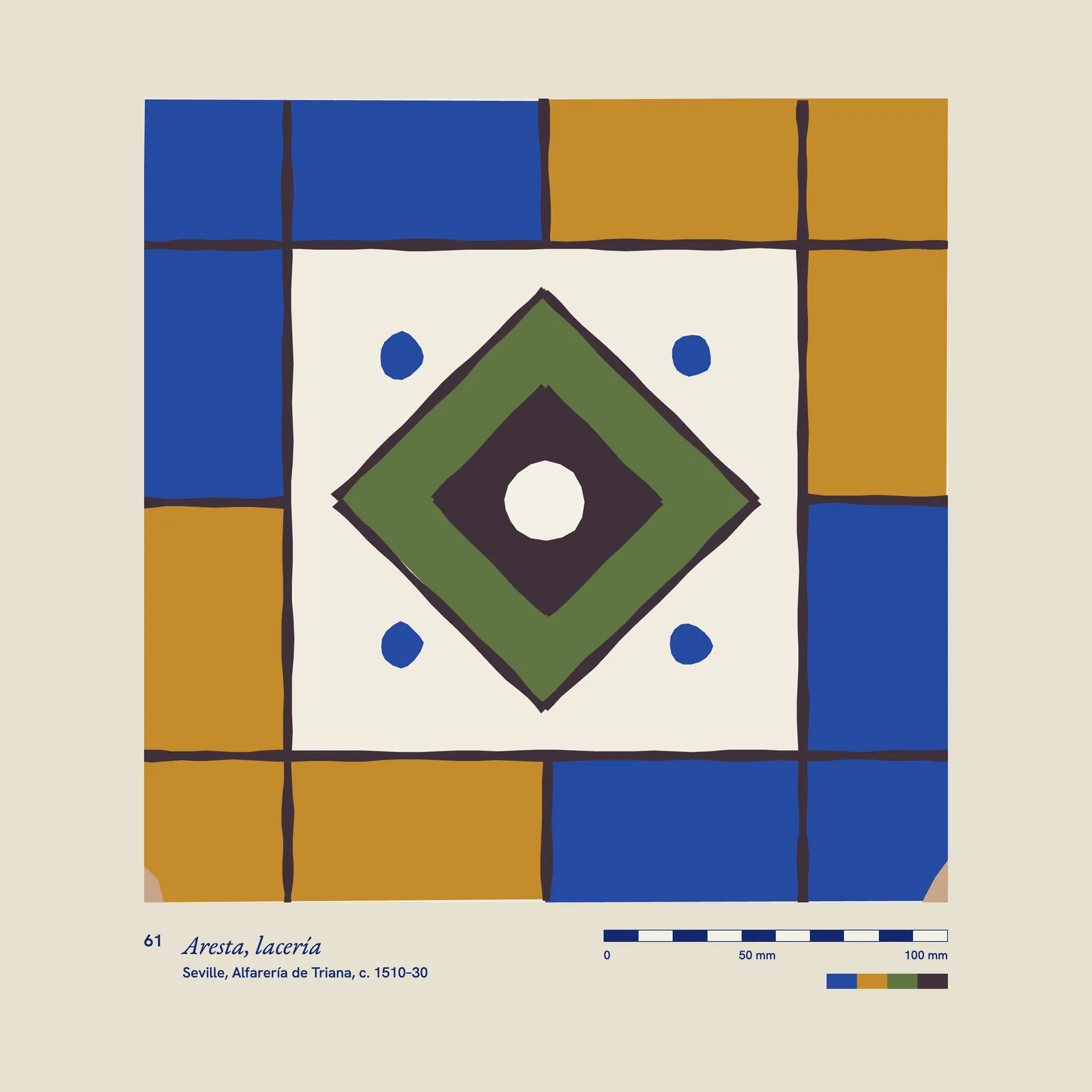
The cover came from the conservation lab. When a tile is lost the museum does not paint a replica. It sets a blank, glazed but undecorated, so that no one will ever mistake the repair for the original. The Cais panel has had two since a fall in 1931. I laid a star-and-cross wall across the boards and left blanks where the title goes. The back cover inverts it, with one surviving tile among forty-seven blanks. The boards are printed in mix E, so the book’s argument is the first thing in your hands.
We ran that fifth unit for nineteen days. By the end the operators could tell a bad sheet from across the floor, before the spectro said anything.
We spot-read every plate against its object or a calibrated capture. The average across 212 plates was ΔE 1.6, with a worst case of 2.4, on a 1962 Metro tile whose blue comes from a refined oxide, which I should have flagged sooner. The first printing of 3,500 sold out in fourteen weeks at a museum shop that had hoped to sell it over two years, and a second printing of 2,000 went on press in the same ink, from the same recipe card.
The result I value most is a small one. In January the conservation lab asked for ten unbound sets of the plates. They now pin them up beside the bench as a colour reference, which is the sentence on the letterhead, carried out by the people who wrote it.
Ends, page 55
Continued on page 56